Application Design II Task 2
Melvin Yung Khun Yew | 0357241 | Bachelor of Design (Hons) in Creative Media
MMD 60204 | Application Design II
Week 5 — Week 7
Task 2: Interaction Design Planning & Prototyping
(Work In Progress)
In contradiction with a statement, design itself is not truly perfect. Thus, I launched another self-evaluation on my previous application design on SPayGlobal, an e-wallet app that provides monetary services in Sarawak state for the residents. In this first task, I explored the many design details I lacked previously and made adjustments to each of the mistakes to provide a more intuitive and user-centric design.

|
| App Redesign on Figma |
These are the jump links to each part of this portfolio
Instructions
Mr Razif Mohammed, my section lecturer for the Information Design module for this short semester, gives us a heads-up on the upcoming tasks and exercises.
Description
Students are required to develop a comprehensive interaction design plan for their final web-based mobile application, including detailed wireframes, user flow diagrams, and prototypes of both micro and macro animations. The goal is to visually and conceptually prepare the interaction design and animations that will enhance the user experience of their application.
Requirements
1. App Project Files & Walkthrough Video
Work Process
Design Re-evaluation and Redesign
- Top-up Pages
- Top-up result page
- Payment Pages
- Payment result pages
- Pay by QR pages
- Receive payment by QR pages
 |
| Top-up page |
 |
| Top up the result page |
 |
| Payment page |
 |
| Payment result page |
 |
| Pay by QR page |
 |
| Receive payment by QR pages |
Extras: User Wireflow Chart
But I quickly realized that I need an app flow map, which lists out all the macro & micro animations in different screens (transitions). So instead of leaving out this wireflow chart, I just included this together with my user flow mapping on the same Figjam file together which is embedded down at the submission section of this blog.
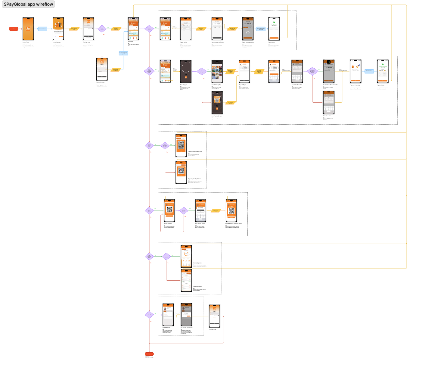 |
| App wireflow map |
App Flow Mapping
By constructing and planning the macro animations, these help to provide a seamless app experience to the users that is coherent with the visual content on the screen. Keeping the animation transitions simple and consistent throughout the app, for example: the slide right animation transitions only applied when the users start interacting with features like top-up, scan & pay, QR pay, QR receive,and profile settings in the app. While the fade-in animation transitions are applied to the rest of the pages.
Navigate to the app flow map here:
App Flow Map
Masterplan
Moving on to the master plan of my app, I focused on the details about the micro animations and interactions occurring on each page. This master plan of mine divides into 3 main stages for every page, such as: Onload state, In-app state, and Offload state.Before conducting the master plan, I have done some research about the onload, in-app, and offload states to describe what happens in each state.
Onload Stage
This stage focuses on the animations and transitions that occur when a page is initially loaded or entered. The goal was to introduce content smoothly by animating elements to slide in—either down from the top or in from the left—using an ease-out timing function to create a gentle motion. On functional screens, key interface elements such as the left arrow, three-dot menu icon, and page title are displayed immediately to ensure users quickly understand their location within the app, fostering a clear and seamless introduction
In-App Stage
The "In-App" stage covers animations and interactions that occur while users are actively engaging with the app’s core features. This includes scrolling behaviors, button tap feedback, section sliding, and modal dialog triggers. Each animation is designed to feel intuitive, responsive, and visually consistent, enhancing both the usability and overall enjoyment of the app experience. These micro animations provide immediate feedback and make interactions feel more natural and engaging.
Offload Stage
This stage accounts for animations and transitions that occur when users exit a screen or complete an action. Whether it's navigating back to the homepage, dismissing a dialog, or moving to another section, these transitions are crafted to feel smooth and purposeful. The goal is to maintain a cohesive visual rhythm and ensure that departures from the current screen feel as thoughtful and user-friendly as entries.
The details of the master plan are in the Canvas PPT slides starting from page 11.
Custom Animation
To make the app interactive and improve the user experience, I have made some custom animations in Adobe After Effects and in Figma.
Which are:
- Logo animation (Loading page)
- Transaction process animation (payment)
 |
| Logo animation in After Effects |
 |
| SPayGlobal logo animation |
As for the transaction process animation, I first start off by illustrating the required illustrations for animations that follow the flat 2D cartoonish style across the rest of the pages.
 |
| Creating visuals in Adobe Illustrator |
 |
| Animating in Adobe After Effects |
| Transaction Process Animation |
Submission
App Flow Map
Presentation Slides
My reflections
Completing this task during a week filled with overlapping module deadlines was undoubtedly tiring, but the results made the effort worthwhile. Seeing the interactive flow of my app take shape gave me a sense of accomplishment, especially as I applied principles of interaction and animation design that I hadn’t used before. Through this project, I developed a deeper understanding of how user feedback can be enhanced through thoughtful visual and motion design.
My process began with creating a detailed wireflow, though I later shifted to a simplified app flow map focused on page transitions to support macro animations. I explored different navigation animations, such as fade and slide transitions between pages, and I implemented micro-interactions on key UI components like buttons. For instance, I designed button states to visually communicate their function — from greyed-out (inactive) states prompting required input, to bright orange (idle), and dark orange (pressed) to indicate interaction. These subtle yet deliberate feedback mechanisms help guide users intuitively through the flow.
All animations and interactive elements were placed based on expected user interaction points — areas where users naturally expect a visual response to confirm their action. I also began exploring After Effects and Bodymovin to create custom Lottie animations, which gave me a clearer picture of how these assets can enhance user experience when integrated into platforms like FlutterFlow. Overall, this task deepened my practical understanding of motion as a design tool, and how to align user expectations with responsive, meaningful interactions.


Comments
Post a Comment