Information Design | Exercises
Melvin Yung Khun Yew | 0357241 | Bachelor of Design (Hons) in Creative
Media
GCD 60504 | Information Design
Week 1 — Week 2
Exercise 1: Quantifiable Information
To give us a brief idea of how information can be quantified and categorised into separate sections, the first exercise we receive gives us students the chance to simulate quantifying raw data and visualize data for easier interpretation and analysis.

These are the jump links to each part of this portfolio
Lectures
Week 1: Type of Infographics
In the first week, I was introduced to the various types of infographics. The lecture made me realize there is so much infographic content, that I've always seen but not properly understood each.
Types of infographic:
Types of infographic:
- List
A list infographic is an informational graphic that uses written list to get a message across. - Statistical
A statistical infographic is an infographic that includes pie charts, bar graphs, and any other visual representations of data. - How-to
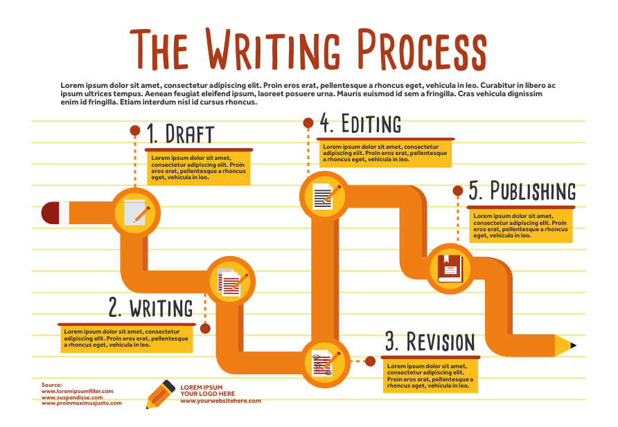
A how-to infographic explains how to do something, like how to solve a problem or perform a task, showing the step-by-step process of certain things. - Timeline
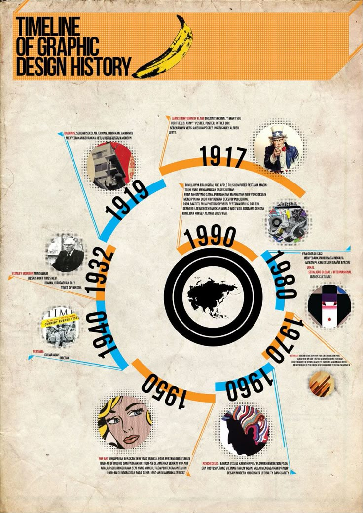
A timeline infographic, as the name suggested, is not only useful and informative, but it’s also visually appealing by showing the information accordingly to the time. - Comparison
A comparison infographic is a visual way to compare and contrast different options. - Map and Location
A map and location infographic is used when a person wants to communicate demographic data or other location-specific information.
- Flowchart
A flowchart infographic is a graphical representation of an information stream, such as a sequence of different steps or actions.
- Process description
A process description infographic visually describes the main elements, actions, and steps of a process.


Week 2: L.A.T.C.H
The LATCH principle is important for a designer to categorize the information they want to convey to others before starting on the design.
Each letter in the L.A.T.C.H represents:
L - Location
A - Alphabet
T - Time
C - Category
H - Hierarchy
Each said, the location refers to the place of origin of the information. Such as the location of a store on Google Maps, the country map and other similar examples. There is also another definition by Graham A., which states that location is to put the most relevant stuff to be within reach.
 |
| Location (available driver on map) |
By alphabet, this means to organize the information alphabetically, simple yet effective for a large amount of data suitable for such arrangement, such as the brand names.
 |
| Arranging contents alphabetically |
As for the time, the content is organized according to its temporal nature (time by hours, weeks, years, eras...)
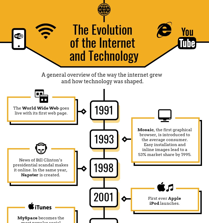 |
| Information portrayed by years. |
Mentioning the category principles, which is the most used technique in organizing content, matches a series of information together with the same nature into a group. Thus, this allows anyone including the users and viewers to quickly find the information. However, the thing to be noted when using the category principle is to make sure everybody has the same mind on agreeing on the content groups that make sense.
 |
| Movie Genres Categorization on Netflix |
Last but not least, the hierarchy applies to anything that requires a flow, which arranges the content by any order (sizes, popularity, cost)
 |
| Content hierarchy on types of medical care |
Instructions
Mr Shamsul Hamimi, my section lecturer of the Information Design module for this short semester, gives us a heads up on the upcoming projects and exercises.
MIB - Module Information Booklet
Exercise 1: Quantifiable Information
Gather a set of objects and separate them into categories such as colour, shape, pattern, and other quantifiable factors.
Example:
1. Box of Lego
2. Jar of button
3. Jar of marble ball
4. Set of colourful rubber straps & more.
In this exercise, you're required to quantify our chosen objects and arrange them into a presentable layout or chart.
The information must be presented as is, and you need to arrange the objects with relevant indicators written out with pens to help you visualize the quantity and data. Examples of objects that can be used are buttons, coins, lego pieces, M&Ms, and more.
Work Process
Exercise 1: Quantifiable Information
I decided to go for the beads with alphabets in a different colour due to their various information categorization possibilities.
The Data
 |
| Unsorted beads |
First Sorting
I sort the beads first according to their respective colours for other sorting later on.

Arranging Data
Later I further played with the arrangement and made them into letters according to their respective colours like "O" for orange, "g" for green, "y" for yellow and continue on.
 |
| #1 Arrangement: Sorting based on colours, arranged based on the first letter of colours |
 |
| #2 Arrangement: Colour tone from cool to warm |
 |
| #3 Arrangement: From less to more |
 |
| #4 Arrangement: Alphabetical order from A - Z |

Explained with story
Information is collected: pink has 10 beads, blue has 11 beads, orange has 18 beads, yellow and purple have 20 beads, and green has the most beads, with 23.

 |
| Final Quantifiable Information |
Exercise 2: L.A.T.C.H Infographic Poster
For the second exercise, I'm tasked to organize a group of information into a visual poster that combines and utilizes the LATCH principles, with a minimum of 4 principles applied.
I decided to select the epidemic and pandemic in Malaysia as the data I compiled for this exercise. Before I started with my design, I listed out all the information I wanted to include in the poster.
Visual References
I go to Pinterest in search of some inspiration and references on how to create a timeline-based infographic poster.


First Design Variation
Originally, I also wanted to incorporate the amount of death toll of each epidemic and pandemic in Malaysia with the height of the timeline, with a higher position representing higher deaths and vice versa.
 |
| First draft |
I noticed that in the first design variation, all the information is cramped together in a small space only, wasting the space on the poster for the information. Thus, I decided to shrink the map and add sections to each timeline.
 |
| Second draft |
 |
| First design |
Not to mention that the poster submission size is in A4 paper sizing, thus I need to rescale and reposition my content, though this allows me to include more information in my poster further on.
To have better readability and contrast on the information, I used bold colours of red and milk-white to better distinguish the text while attracting the viewers' attention.
I also created several illustrations to fit in my poster.
 |
| 1st timeline design |
I also created several illustrations to fit in my poster.


To further spread out the information to prevent clutter, I separate information like the pandemic's death toll into a graph for better visual understanding. Colours and minimal graphics are added to the graphs to make them more visually engaging.
 |
| Death Toll Ranking |
After several attempts to make the whole poster visually appealing while keeping the information legible, I finally came to my final design variation which should keep the visual hierarchy, readability, visualizations, icons and colours in check. This allows for a coherent and comfortable reading flow of the poster.
 |
| Final version |
My reflections
Exercise 1
It is relatively simple, yet the possibilities behind arranging and presenting that information (beads) are unlimited.
It is relatively simple, yet the possibilities behind arranging and presenting that information (beads) are unlimited.
Exercise 2
This exercise looks simple but it hides several design principles for us to follow in order to create a visually appealing and informative infographic poster. Through this exercise, I've learned to always keep the design principles in mind, even though I've known it since 2 years ago. This exercise is a wake-up call for me to be more expressive and considerate to create not only a good infographic poster but also applies to the rest of my design journeys like UIUX, photography and more.


Comments
Post a Comment