Interactive Design | Project 3
Melvin Yung Khun Yew | 0357241 | Bachelor of Design (Hons) in Creative Media
GCD 60904 | Interactive Design
Week 8 — Week 14
Final Microsite Coding
After Mr Shamsul provided us tutorials on CSS coding to include multiple functions available for us to utilize and add to our own websites. It is now that we put our HTML and CSS knowledge from the entire semester to the test.

These are the jump links to each part of this portfolio
Instructions
Mr Shamsul Hamimi, my module coordinator and lecturer for this semester, provided us with the necessary files including the module information, and reading elements to give us a headstart on this module.
Project 2 - Working Web Page
Design a single-page microsite that consists of at least five distinct sections. These sections should flow seamlessly and provide a comprehensive experience for the user.
Learning goals:
- Critical Thinking Competencies – Use ideation strategies to synthesize assess and evaluate prototype/final product outcomes for further development.
- Appraising And Valuing Competencies – Analyse and measure performance and self-development through constructive feedback, assessment, self-evaluation and consultations.
Work Process
Project Overview:
For my final task in the Interactive Design module, I am creating a single-page website with a visually engaging and interactive design. The project focuses on the promotion of the game Honkai Star Rail, incorporating elements from popular game interfaces and a space-themed colour palette.
 |
| Official page of Mario by Nintendo |
Website Color Palette
 |
| Space theme colour palette |
Figma is used to develop the website visual design prototype.
- Header
- Hero page (Call-to-action button)
- Content Section (Game Story, Gameplay, Character Paths, Combat Types, Regions, Musics)
- Comment/Request Form
- Footer
Website Layout and Structure:
- Layout: The website follows a centre-aligned style to maintain a clean and organized appearance.
Centre-aligned design - Sticky Header: Designed a sticky header with a navigation bar, which includes sections for story, gameplay, paths, combat types, regions, and music.
Header with navigation button - Call to Action: A prominent call-to-action section is placed to direct visitors to the official Honkai Star Rail website for game downloads
"Free Download" Call-to-action button


Visual Elements:
- Background Illustrations: Incorporated illustration images from Honkai Star Rail as section backgrounds to create an immersive experience.
Game illustration as a background - Image Carousels: Added image carousels to introduce the multiple free-roam maps available in the game.
Interactive image carousel - Music Album Slideshow: Designed a constant sliding music album slideshow that allows visitors to interact and access the music album for listening.
Scrolling music album


Interactive Features:
- Download Platforms: At the end of the page, a small call-to-action button provides links to different download platforms (PS5, PC (Epic Games), Google Play, App Store) for easy access.
Download button - Comments and Messages: Included a section for visitors to leave comments or messages, request updates or information, or share their opinions, with a form section (email, comment form).
Comment section


Footer Design:
- Additional Navigation: The footer contains additional navigation to individual sections of the webpage and links to other websites introducing the game company and their social pages (Twitter, YouTube, Instagram, Facebook, Discord, Hoyolab).
Additional Navigation section

Importing the custom fonts from Google Fonts

Set the key logo for the webpage icon
 |
| Tab Icon |
 |
| Game Logo |
Set container for the body
 |
| Header |
 |
| HTML addition of <ul> unlisted order for the navigation button |
For the navigation bar, I coded several CSS and even JavaScript to make it interactive upon hovering and clicking it. JavaScipt makes the animation of the navigation bar activate and reset to the original state when clicking on a different button.


 |
| JavaScript Visited status removal |
I also place the game logo image on the left side of the navigation bar, and it can act as the button to navigate to the home section, which leads the viewers all the way up to the top of the webpage upon clicking it.
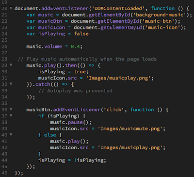
Upon closer inspection, you can observe that I include a music-like icon at the header too. That's right, I have added the background music for the viewers that can be switched on and off when browsing the page.


To achieve the interactable switch for music, I have included HTML, CSS and JavaScript code for it to work as I intended. For the HTML and JavaScript code, I have searched and learned them on the Internet.
<audio> and <source src> to include audio
 | ||
HTML code
|

 |
| JavaScript code |
For controlling the width which I use a lot in my code, I use the measurement of the viewport height (vh) and viewport width (vw) so that my content can be dynamic across different screen sizes instead of using pixels (px) measurement.
I also controlled the background music volume to 40% of the original volume using JavaScript too.
 |
| Hero section |
To make the image remain static from the scrolling action, I added the background-attachment: fixed code.
 |
| CSS Background image code |
About the Game
 |
| About The Game |
 |
| CSS About section |
 |
| CSS Header 2 and paragraph control |
Character Paths
 |
| Character path |
 |
| HTML Row and Column code |
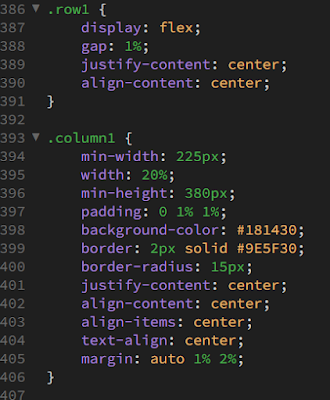 |
| CSS Row and Column code |
Regions/Worlds
 |
| Bootstrap |
I linked the document with their CSS and JS file via CDN, by including the <link> command at the start of the HTML document.
 |
| Link reference to Bootstrap CSS and Javascript |
 |
| Image carousel with button and indicators |
 |
| HTML carousel code |
I also code the CSS to allow me to control the images, buttons and indicator sizes that can be sized according to the screen size.
 |
| CSS carousel code |
 |
| Music album slide show"carousel" |
 |
| Album slide show |
 |
| Platform download session and comment section |
 |
| HTML Fieldset form |
 |
| CSS fieldset form styling |
Lastly, I added a footer to my webpage to add an additional navigation link section and credited my work with copyright. At the same time, I also include a ESRB Teen Rating to inform the viewers about the intended age group for the game.
 |
| Footer with additional navigation and copyright info |
 |
| HTML additional navigation link with multiple columns |
Mobile View
To ensure a responsive webpage screen resolution dimension throughout different devices such as mobile phones, I also coded a separate coding specially for the mobile screen apart from the normal CSS webpage code. |
| CSS code for smaller screen size at 996px or lower |
Here are the examples of the mobile view of the webpage:


Access the HTML, CSS and JavaScript files here:
Google Drive


Comments
Post a Comment