- Header
- Hero page
- Project Gallery
- CV
- Footer
Importing the custom fonts from Google Fonts
Upon selecting the font of my choice, I embed the Poppins font from Google into my code using the pre-connect link reference to import the font for website use so that I can use the custom font for my content.
Set the key logo for the webpage icon
I'm using the logo I've designed before to be the icon of the webpage so that the webpage tab will be more visually appealing instead of using the default mono-colour icon.
 |
| Tab icon |
 |
| Logo icon |
Set container for the body
Header
For the header, I made a navigation bar for easier access and navigation on my online CV webpage compared to just scrolling the webpage all the way to find the exact position of the section.
I made an interactable navigation button for the profile, education, experience, skills, projects and contact. That way the viewers can click on those and get quicker results.
 |
| Header navigation bar |
Just in case you've wondered, I also place my logo image on the left side of the navigation bar, and it can act as the secret button to navigate to the home section, which leads the viewers all the way up to the top of the webpage upon clicking it.
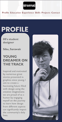
Hero/Introduction section
Finishing up with the header, I made my first section container with a linear colour gradient to make my image border more subtle to the eyes. Aligning both the paragraphs and the image on the same line, I place my description on the side to give the viewers a quick introduction to me while maintaining the hierarchy of the text using different headers and font sizes.
 |
| Hero/Introduction section |
My project galleryTo give the viewers a quick glance at my past projects and works, I included a small gallery of my work in a section container. Initially, in this section, I was having a hard time making the image dimensions unaffected by the responsive webpage I'm trying to achieve, but I'm glad that I'm able to solve the issues after searching for solutions on the Internet such as flex-wrap and object-fit attributes to acquire the effects I want.
 |
| Project Gallery |
CV sectionTo make the section more visible and separated from the other section, I filled the section container with a deep blue colour to make a contrast between the webpage.
 |
| CV content section |
In this section, I fully utilised the function of the rows and columns, which makes the content appear on the left and right of the webpage to achieve the design I want.
To isolate the different information in this section, I created a solid colour container for all of them and labelled each container with titles to indicate the type of information on top of the container box.
In order to create more ordered and aligned content in these boxes, I input the information in the ordered list command.
Example of ordered list contents
I also code in circles with the icons beside the title of the container box to indicate the individual sections. Icons beside the title text
Footer
Lastly, I added a footer to my webpage and credited my work with copyright. :) |
| Footer |
Mobile View
To ensure a responsive webpage screen resolution dimension throughout different devices such as mobile phones, I also coded a separate coding specially for the mobile screen apart from the normal CSS webpage code.
Due to the smaller screen ratio of the mobile phone, I adjust the individual parameters for each attribute so that the elements will be aligned properly when viewing the page on the phone.
 |
| CSS coding for smaller screen size |
Here are the examples of the mobile view of the webpage:


Comments
Post a Comment