Application Design II Task 1
Melvin Yung Khun Yew | 0357241 | Bachelor of Design (Hons) in Creative Media
MMD 60204 | Application Design II
Week 1 — Week 4
Task 1: App Design 1 Self-Evaluation and Reflection
In contradiction with a statement, design itself is not truly perfect. Thus, I launched another self-evaluation on my previous application design on SPayGlobal, an e-wallet app that provides monetary services in Sarawak state for the residents. In this first task, I explored the many design details I lacked previously and made adjustments to each of the mistakes to provide a more intuitive and user-centric design.

|
| App Redesign on Figma |
These are the jump links to each part of this portfolio
Instructions
Mr Razif Mohammed, my section lecturer for the Information Design module for this short semester, gives us a heads-up on the upcoming tasks and exercises.
Description
Students are required to perform a self-evaluation and reflection based on their mobile application design 1 final project. This project aims to document the issues, problems, and difficulties and propose solutions to improve the aesthetic and user flow of the mobile app design. Mobile App design is an iterative process, and this task will expose students to the constant improvements one can make to their app. Students are required to submit the documentation in Google Docs for ease of commenting and feedback by the module coordinator.
Requirements
To submit a self-reflection blog post on the app design refining process with a clear comparison between the old and new design.
Work Process
Past Design Evaluation
In my self-reflection, I separated my problem findings across my designs into various page sections:
- User Login
- Dashboard
- Profile
- Payment Page
- Transaction Success
- Transaction History
- Loyalty Rewards
- Voucher Claim
User login page


Dashboard


Profile
While reviewing the profile screen, I noticed a few things that could affect both usability and accessibility. First, the black text on the orange background, like the user name and verification status, didn’t have enough contrast. Many users find this hard to read as it doesn’t follow WCAG guidelines for accessible color contrast. To improve this, I placed those texts inside white cards, which makes them stand out more and easier to read.
I also found that the buttons in the settings area felt too small to tap comfortably, especially on mobile. While the layout was already aligned properly, the tap targets didn’t give users enough space. According to Fitts’ Law, smaller touch areas take more time and effort to use. So I increased the padding around each button to make them easier and more comfortable to tap.
Another issue was the small back button at the top-left corner. It worked, but the size made it easy to miss, which could frustrate users trying to return to the previous screen. I made this button larger and more visible to improve usability and meet the recommended touch size of at least 44x44 pixels.
Lastly, I redesigned the navigation tabs between Account, Security, and Support. The old design used squareish rectangular buttons with low contrast, which made it hard to tell which section the user was in. Based on Jakob’s Law, users expect designs to behave like familiar apps. So I switched to a rounded, smoother style with clearer color contrast, making it easier for users to know where they are in the interface.
Overall, these changes improve readability, touch interaction, and section awareness, making the profile page easier to use and more user-friendly.


Payment Page
When revisiting the payment screen, I noticed that the separation between content elements on the payment amount and remarks wasn’t strong enough to guide the user’s attention. Originally, both the input fields and background cards used very similar tones, which are a mix of white and grey that made the screen feel flat and harder to scan. To improve this, I changed the card background to orange, creating better contrast with the white input boxes. This adjustment helps guide the user’s eye to where they need to focus, following the principle of visual hierarchy and improving clarity through contrast.Another issue was with the Call-to-Action (CTA) button. The original "Pay" button had low contrast between the background and the text, which made it less visually prominent, potentially affecting users with visual impairments. According to WCAG guidelines, strong contrast is important for readability. I fixed this by increasing the color contrast between the button and the text. I also moved the button upward from the very bottom of the screen to make it easier to reach with a thumb, especially for one-handed users. This follows Fitts’ Law, which shows that smaller or harder-to-reach targets increase the time it takes to interact with them.
For better layout consistency, I applied the 8pt grid system to align all interface elements and create even spacing between content blocks. This improves both visual rhythm and scannability, helping users process information more smoothly. Lastly, I increased the size of the business profile icon, so users can better recognize the merchant they are paying. This provides a stronger sense of confirmation and supports user trust, which is crucial during financial interactions.


Loyalty Rewards
The loyalty reward page is one of the key features that SPayGlobal stands out for, where users can be kept engaging with the app by claiming the points earned from transactions with businesses.In the original design, I noticed that users might struggle to find the rewards they want. There were no visible reward categories like F&B or Lifestyle, so users would need to scroll through all vouchers just to find something relevant. This could cause longer screen time and frustration, possibly leading to higher bounce rates. To solve this, I added a category slider at the top of the screen. This lets users quickly tap on a filter and jump to a group of vouchers they’re interested in, improving usability and supporting Hick’s Law, which suggests reducing the number of choices at once helps users make quicker decisions.
I also introduced a new feature — the Voucher Favourite System. This allows users to “pin” vouchers they’re interested in, setting them as a personal goal. The pinned voucher links to the points progression bar on the dashboard, so users can instantly see how close they are to claiming it. Without this, users would have to keep switching back and forth between the voucher screen and the dashboard to track their progress. This feature supports motivation and goal-setting, and aligns with BJ Fogg’s behavior model, which focuses on making the desired action easier and more rewarding.
Lastly, I updated the navigation bar at the top of the voucher screen. The older design used square-ish tabs with too much spacing, and visually clashed with the new rounded, smoother navigation used across the rest of the app. According to Jakob’s Law, users expect consistency across similar screens. So I redesigned the nav to match the newer look, making it more unified and easier for users to understand where they are.


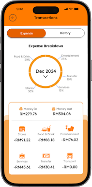
Transaction History
For the budget-conscious users, this screen is the most important for them, which allows to check on their past spending and record it down for further reference.In the original design of the transaction screen, I found that too much information was being repeated across different parts of the interface. For example, when users tapped the “Details” button under the expense breakdown, they were taken to another screen where the same pie chart appeared again. This not only created unnecessary repetition but also made the interface feel cluttered. To improve this, I decided to merge the chart and amount breakdown into one unified view, so users can see all relevant data in one place without switching screens. This supports information clarity and follows Nielsen’s heuristic of minimizing unnecessary duplication.


Voucher Claim Details
When reviewing the voucher detail screen, I noticed a few areas where the design could be improved to reduce cognitive load and improve readability. One issue was information repetition — the required number of points to redeem the voucher (e.g., “200 points”) was shown both at the top and again in the bottom checkout section. Repeating this too often made the screen feel more complex than it needed to be. I removed the duplicate to streamline the information hierarchy, following Nielsen’s Heuristic of recognition over recall and avoiding unnecessary mental effort for the user.
The second issue was the tight spacing between content cards, which made the screen feel visually cramped and harder to scan. To solve this, I applied the 8pt spacing system again to create consistent padding and improve visual rhythm, allowing users to comfortably move their attention from one section to the next. This supports Gestalt’s Proximity Principle, where well-spaced content is easier to understand and process.
Another challenge was content contrast in the checkout section at the bottom of the screen. Originally, this used a bright gradient background that made the text hard to read. I changed the background to white, which improved legibility and made the text easier to scan. I also updated the "Redeem" CTA button to use a stronger orange color that better contrasts with the background, making it more noticeable and in line with Fitts’ Law — users can now identify and tap the button faster and with more confidence.
As a smaller visual improvement, I also adjusted the paragraph text color for the “Where to use” and “How to use” sections. Instead of using solid black, I switched to a softer dark grey, which reduces harshness and creates a more comfortable reading experience. This helps support a natural reading flow from top to bottom and improves visual balance across the screen.


Transaction Success
During the process where the user has successfully made payments, a feedback page will be shown to notify them about the transactions. The payment success screen is a key moment that confirms completion and builds user trust, so clarity and visual balance are especially important.In the original version, I noticed that the spacing between the success icon and the “Payment Success” text felt cramped. To improve readability and flow, I applied the 8pt grid system once again to create more consistent vertical spacing, giving the content better structure and visual breathing room.
One major issue was the icon and text balance in the reward summary. The cashback and points icons were quite large and took up more space than necessary, pulling focus away from the actual numbers users care about. To fix this, I reduced the icon size and placed them side by side with the earned amount text, making the layout more compact and shifting visual focus back to what matters: the reward values. This also helps keep more important content, like transaction details, within immediate view.
In the payment details section, the original text used medium grey on a light grey background, which didn’t meet WCAG color contrast standards. This made it difficult for some users to read the information, especially in bright environments. I adjusted this by increasing the text color to a darker grey, ensuring better legibility and alignment with accessibility best practices.
As with other screens, I also increased the contrast of the “Done” button and moved it slightly upward for easier reach, especially for users navigating with their thumbs. This follows Fitts’ Law, improving tapability and creating a consistent experience across the app.


Presentation Video
My reflections
Through this first task, I’ve gained a deeper understanding of how even small design choices can significantly impact usability, clarity, and user satisfaction. By reviewing and refining my previous app screens, I’ve learned to evaluate my work more critically, not just based on visual appeal, but also on how well it supports user goals and accessibility standards.
Applying principles like Fitts’ Law, Hick’s Law, Jakob’s Law, and WCAG has helped me make more informed decisions, whether it's improving tap targets, reducing cognitive load, or increasing text contrast. I also found the use of spacing systems, such as the 8pt grid, to be essential for maintaining consistency and rhythm throughout the interface.
This process reminded me that good design is about purpose, not just aesthetics, where the user experience is shaped by both the visible and invisible details. Moving forward, I feel more confident in applying UX principles to create cleaner, more functional, and user-centered mobile app designs.


Comments
Post a Comment