Major Project 1 | Task 3: Concept Presentation
Melvin Yung Khun Yew | 0357241 | Bachelor of Design (Hons) in Creative
Media
PRJ 64904 | Major Project 1
Week 5 — Week 7
Task 3: Concept Presentation
With all of our collected user research analysis, it's time for our team to develop our solution into a prototype, allowing anyone who's interested to have a brief idea of what goals we pursue and our proposed solution in low fidelity conceptual examples.
 |
| Our Proposed Solution Graph |
These are the jump links to each part of this portfolio
Instructions
Dr Wong Chui Yin, my section lecturer of the Information Design module for this short semester, gives us a heads up on the upcoming projects and exercises.
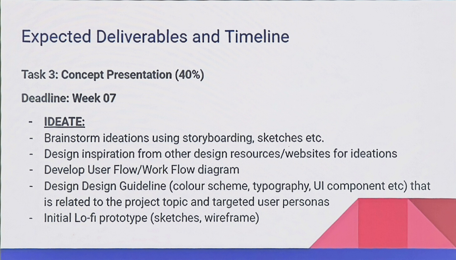 |
| Expected Deliverables and Timeline of Final Task |
Task 3: Concept Presentation
Our team is required to present our project as the final showcase of how our design solution effectively meets a specific need within our target audience. We need to demonstrate how our newly developed product or service brings unique social, cultural, or economic value.
The presentation will be assessed based on our attention to detail and how well we execute key conventions within our area of specialization. This includes organization, content, presentation format, aesthetics, and overall style.
We will be presenting to a panel of academics and/or industry guests through a slide presentation that follows our proposal structure and includes our preliminary design concept. Our presentation must clearly explain how our solution considers various contextual factors and explores new design directions or approaches. Additionally, we need to reflect on our design journey by discussing both successes and challenges, including the design review process, outcomes, and areas for further improvement.
Work Process
Task 3: Concept Presentation
It's time for our final brainstorming and meeting sessions after our task 1 and task 2, which is essentially one of the most important parts of our major project. We started by categorizing and visualizing our proposed solution into a graph, helping us to focus on the task and easier distribution.
 |
| Task Splitting among Teammates |
Chapter 2: Conceptualizing
By the time we end our meeting together, we are all on the same page on what our digital and physical deliverables of our major project will be, which are: interactive-immersive websites and physical AR souvenirs. Before we fully committed to the wireframe of our websites, the four of us began to search for web design reference that regards and aligns with the experience we want to provide for the users. Referring to the website design pages such as awwwards.com, all of us documented and referred the designs to our FigJam board, allowing each other to take inspiration.
 |
| Visual Reference by Melvin and Winnie |
 |
| Visual Reference by Si Yan |
Chapter 3: Information Architecture
Regarding the information architecture, I pondered upon all the contents of our website and decided to draft an IA map before I met with the other groupmates again, to provide them with a rough idea of the information in our immersive websites.
 |
| 11 March 2025 - First IA Map Draft |
After that, Winnie began to assist me with the Information Architecture map by utilizing the card sorting method using Optimal Workshop. Her categorizations definitely help me to visualize all of the content on our websites. Hence, I went on to make the information architecture whilst also taking reference on how to make an information architecture map online.
 |
| 14 March 2025 - First IA Map Version |
When I dwelled on what are the suitable colours for our website, I began to note down our website topic: Disappearing Cultures. Yes, culture! Especially since we're focusing on traditional cultures. Thus, this gave me the opinion to focus on portraying the true colours of the culture, and here it gave me the inspiration to take reference to the colours from all of the traditional crafts.
 |
| Colours from the traditional crafts of Baba Nyonya |
At the same time, I also check the suitability of each colour: whether they will match with the colour theories like complementary colours etc.
 |
| Colour theories |
I also understand the importance of keeping the colour balance on our website, thus I utilized the 60-30-10 colour rule (primary, secondary, accent colour) on the website.
 |
| Light and Dark theme UI colour rule |
Before commencing our low-fidelity website prototypes, I joined hands with Lin Si Yan to make a simple UI kit for our websites, setting guidelines when we're making the wireframes later on.
- Scaling (margins, padding)
- Colours
- Typography
- UI elements (buttons)


Landing Pages


Cultural Introduction

Baba Nyonya Showroom


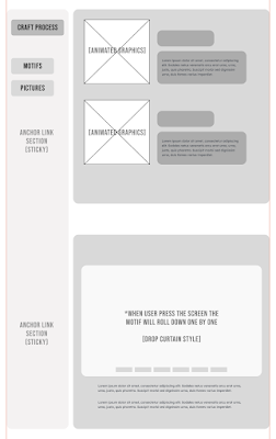

In order for the others to understand what the animated graphics for the crafting process of each traditional craft, I began to sketch out drafts of the graphics, showing the step-by-step process of making each art, which can be effective in describing the process and visually engage the viewers with dynamic content at the same time.
 |
| Sketches of Animated Infographics (Step-by-step Process) |
 |
| 18 March 2025 - Information Architecture Map Version 2 |
 |
| UI Buttons Recolour to match WCAG |
Preparing and finalizing our presentation slide for high-level information presentation to the judge panels the next day, I started to prepare myself for the upcoming presentation by making scripts and presentation speech training ourselves, with each of us focusing on our own sections to present upon further communication with the other teammates.
We arrived and rendezvoused at the campus's classroom earlier at 9am before our 11.40am session, where we made further preparations by going through a proper 12-minute presentation time limit.
 |
| Week 07 19 Mar 2025 - Lecturer panel to view our team's concept presentation |
Albeit a little nervousness surging in my heart, I managed to pull off a smooth and successful presentation together with my team with their flawless presentation speech too. I'm grateful that we all can come together and deliver our ideas to the lecturers.
After our presentation, I had a photograph session with my group to commemorate this moment where we overcame another challenge. Yippie!


PDF Presentation Slide
View our Figjam board here:
FIGJAM BOARD
FIGMA WIREFRAME
My reflections
This task took me through a rollercoaster of emotions—from the pressure of balancing multiple tasks to the ultimate fulfilment of seeing our team's hard work come together in a successful presentation. Among the various responsibilities, one of the biggest challenges I faced was understanding and structuring the IA map properly. Initially, I struggled with mapping out the right content flow, but with Dr. Wong’s feedback and my team’s collaboration, I managed to refine it and ensure a clear and effective website structure. Despite the intensity of preparing for the concept presentation, the teamwork and support among my groupmates made the process smoother and more enjoyable.
Findings
This experience reinforced my understanding of how user-centred design is the backbone of an effective digital product. Beyond just aesthetics, creating an engaging website requires strategic planning, thoughtful structuring, and accessibility considerations. More importantly, I realized that design is never a solo effort—the collective effort of my team, with each person bringing their expertise, resulted in a presentation that we could all be proud of. Seeing our ideas come to life and successfully communicating them to the panel was a rewarding moment, proving that all the challenges and late-night refinements were worth it.
Ultimately, this task not only deepened my technical skills but also strengthened my ability to collaborate, receive feedback, and refine ideas iteratively—all of which are invaluable in my journey toward becoming a better designer.


Comments
Post a Comment