Melvin Yung Khun Yew | 0357241 | Bachelor of Design (Hons) in Creative
Media
DST 60504 | Application Design I
Week 1 — Week 4
Mobile Application Proposal
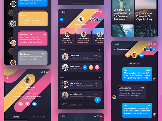
Taking on the first task of my design specialization module, I'm grateful that this module allows me to take on the imperfect UI UX design in the application I found and used previously.
 |
| Image by UX Planet |
These are the jump links to each part of this portfolio
Instructions
Mr Zeon Wong, my module coordinator and lecturer for this
semester, provided us with the necessary files including the module
information, and reading elements to give us a headstart on this
module.
MIB - Module Information Booklet
Project 1 - Mobile Application Proposal
In this assignment, I'm required to create a proposal documentation for my mobile application project, where I need to redesign an existing app that I found unsatisfactory in terms of the user experience or interface design.
Deadline: Week 04
Conducting surveys, interviews, and market studies on the selected topic for in-detail information.
Including the key features of the mobile application and providing a clear flowchart of the app.
Learning goals:
- Conceptual and Cognitive Competencies – Demonstrate and apply knowledge of design principles technical processes, tools, and software.
Work Process
Project Overview
When Mr Zeon emphasized the importance of UI/UX design in application design during physical class, I understood that every design process of conducting user research, determining app designs, obtaining user feedback and enhancing design are crucial parts of a successful application design. This is where Mr Zeon left me with the task of coming up with three app redesign ideas.
First Draft: Ideation
The first application that came into my mind is the application I found used by the people of my hometown Sarawak, which is called S Pay Global. Especially after seeing the user experience of my family and relatives, I felt the need to take this app into the matter to redesign it to provide a more pleasurable experience when using the e-wallet function.
 |
| S Pay Global, a Sarawak's fintech app |
For the rest of the application idea, I found the problematic UIUX design in both the GSC (Golden Screen Cinemas) and KFC Malaysia apps after some scrolling around the app store, with the low ratings of 2 stars as evidence of my findings.
Accumulating and finalizing my ideas, I began further observations into the application, where I collected summaries of app features and their app's weaknesses. These observations are recorded in the presentation slides I made for easier viewing.
Here is my first draft documentation:
Topic Confirmation and Research
I made my decision to extend my topic research to the S Pay Global app, where I have more experience and opinions of the app rather than the other two applications that I rarely used in my life.
Confirming with Mr Zeon about my choice of topic, I hastily work on gathering more information on my app of choice to gather insights for making a better redesign decision later in the assignments.
The information I found includes:
- The developers and the app's objectives
- App's success history
- App's user demographics
- App competitor's user demographics
- App's features and screenshots
- App reviews on the Google Play Store
- Strengths and Weakness of the app
- Competitive comparison and analysis
After completing my research phase, I began to conclude the data and understand my redesign initiative goals and design strategy, where I provided my feedback on some design suggestions I could make during the redesign phase. To further enrich and support my proposal, I also planned to conduct user surveys and questionnaires to understand my application's target audience more and act as direct feedback for my app redesign later on.
Physical Presentation
Completing my proposal documentation presentation slide, I prepared myself for the physical presentation in the classroom. Even though I thought that I was prepared for it, that's when I found some of the key information that I hadn't prepared before when reviewing the other peer's work. In short, I still have a lot to learn not only from the lecturers and professionals but also from those around me too!
Post-presentation Enhancement
From the presentation in class, I found some of the things I lacked in my presentation when Mr Zeon, my lecturer mentioned the point of what differentiated my app of choice from the other competitors' applications. That's where I added more points to my presentation documents before my submission.
Final Proposal on Canvas, 18 October 2024
Or access
my final proposal separately:
My reflections
With this assignment on the design proposal, I'm grateful that I can express my dissatisfaction with the application I found that annoyed me. Even though I believe that I still can do better in compiling more detailed information on my application to aid me further down in the other assignments, I've learned quite a lot with just this first assignment in one of my first second-year modules, especially from the peers.


Comments
Post a Comment