Advanced Typography | Task 1
Melvin Yung Khun Yew | 0357241 | Bachelor of Design (Hons) in Creative
Media
GCD61004 Advanced Typography
Week 1 to Week 4
Hello to Advanced Typography!
After the introductory class to the world of typography in the first semester of my first-year degree, I was greeted by another chance for a deeper comprehension of the typography knowledge compiled from centuries ago till now.
Image of the post: The Joker Graphic Typography

These are the jump links to each part of this portfolio
Lecture summary
Typographic systems
 |
| Fig 1.1.1 by Benjamin Kowalski |
 |
| Fig 1.1.2 by Julius Teoh Hoong Hoon |
 |
| Fig 1.1.3 by Michelle Marzec |
 |
| Fig 1.1.4 by Tamara Audrey |
 |
| Fig 1.1.5 by Beck M |
 |
| Fig 1.1.6 by Julius Teoh Hoong Hoon |
 |
| Fig 1.1.7 found in 3dwiiin's WordPress |
 |
| Fig 1.1.8 by Tamara Audrey |
 |
| Fig 1.1.9 found in thegridsystem.org |
 |
| Fig 1.1.10 by Tamara Audrey |
 |
| Fig 1.1.11 by Martin Lorenz |
 |
| Fig 1.1.12 by Tamara Audrey |
 |
| Fig 1.1.13 by Graphéine |
 |
| Fig 1.1.14 by Julius Teoh |
 |
| Fig 1.1.15 by Vinish Kumar |
 |
| Fig 1.1.16 by Tamara Audrey |
Typographic Composition
- When we think about composition, we think about emphases, isolation, repetition, symmetry, asymmetry, alignment, and perspective to name a few. However, these abstract notions seem ambiguous when we translate them into typographic layout or composition, so they seem more relevant to imagery than complex units of information.
- However, some of the principles are a bit easier to translate to the typography composition: emphasis...
Fig 1.2.1 Emphasis on paragraph composition

- Notions like repetition or notions like perspective are not easily transferable to typographical composition and are more applicable to visual imagery as opposed to textual information or disparate information within a given space.
- The Rule of Thirds is a photographic guide to composition. It suggests that a frame of a space can be divided into three columns, which are three columns and 3 rows, and that the intersecting lines are used as guides to place the point of interest within a given space.
Fig 1.2.2 The Rule of Thirds
But realistically speaking, no one will consider using the rule of thirds for the layout.Fig 1.2.3 Rule of Thirds on layout design


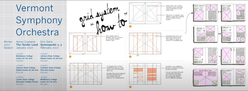
- The rule of thirds is a compositional element that is used to make decisions on the placement of important information within a given space. The most pragmatic and used system is the Grid System (Raster Systeme), which is derived from the grided compositional structure of letterpress printing.
Fig 1.2.4 Letterpress printing

- The Swiss (Modernist) style of Typography enhanced the Grid System by introducing elements of excitement and engagement within its rather rigid structure.
Here are some examples of how the system would look like:Fig 1.2.5 Enhanced grid system
While the grid system may seem old and rigid, its versatility allows for an infinite number of adaptations and permutations. This is why it continues to remain popular.
- In reaction to the ordered approach to the typography of the modernist era, a group of younger designers began to question and challenge this notion of order.
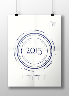
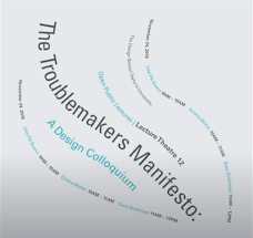
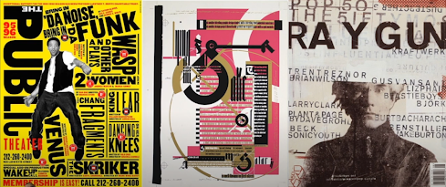
Thus, in the post-modernist era in topographical systems, where chaos, randomness, and asymmetry, were explored, legibility and readability were relegated to the back seat. These people were rebelling against clean-cut layouts and arrangement, so they explored radial dilation and random asymmetrical alignment.Fig 1.2.6 Post-modernist era typographic posters
- The balance was created using the Environmental Grid system, which is based on the exploration of an existing structure or numerous structures combined. This system was used to create organization and structure in the form of a very exciting visually impactful design.
The designer organizes his information around the superstructure to create a unique mixture of extra and visual stimuli. This approach is considered post-modernist in many ways, shape or form, but it is taking it now from its approaches slightly more different.
Using a structure, you create lines and curves that represent the structure and then you base your informational arrangement around that particular structure. This is a credible, informative and interesting approach to layout design.
Here's an example from Brenda McMannus:Fig 1.2.7 Example from the book Typographic Form and Communication, pp211

- Form and Movement
People are thinking of new ways to adopt an idea and create something unique by using the formula worked out.
Mr Vinod developed a system based on the exploration of an existing grid system to get us to create something unique from that. The result is something incredibly different, original or unique, as it dispels the seriousness surrounding the application of the grid system.
The formulas for creating movement from one square to another are crucial for book design.
The placement of a form on a page over many pages creates movement, which keeps the reader engaged. Otherwise, the form becomes predictable and less engaging for the viewer and reader.
 |
| Fig 1.2.8 Layout examples of unique grid systems |
- The nine spreads are based on a grid system, and minor elements are introduced along with the larger elements to maintain a connection between one spread to another spread. This is then used to animate in a faster way to show you how visual impulses are created through movement on the page.
Fig 1.2.9 Sample examples of grid systems - The final quote of the lecture: "There is a fine line between genius and insanity, just as there is a fine line between legibility, readability and memorability." The first point came from Oscar from the Levant and the second point from Mr Vinod.

Context & Creativity
- Handwriting is important in the study of type because the first mechanically produced letter forms were designed to directly imitate handwriting. The shapes in the line of hand-drawn letter forms are influenced by the tools and materials used to make them.
The proto-Sinaitic letter forms are like ideograms, picked abroad, little icons. They are a thousand seven hundred fifty years behind where the Latin alphabet originated.Fig 1.3.1 Evolution of Latin Alphabet by Matt Baker

- The Phoenician letter was the first written language based on sound, and it was used in Phoenicia, which is on the west coast of the Middle East Ancient this would influence the Ancient Greek letter, which would then influence Latin, and then influence influence the Roman alphabet.
Fig 1.3.2 Cuneiform c.3000 B.C.E
Cuneiform, is the earliest system of actual writing, was used in a number of languages between the 34C. B.C.E through the 1st century C.E. Its distinctive wedge form was the result of pressing the blunt end of a reed stylus into wet clay tablets. The cuneiform characters were written left to right.
The Egyptian writing system was a mixture of both Rebus and phonetic characters and could be used in three different ways as ideograms, to represent things that they depict as determinatives, to show that the signs preceding are meant as phonograms, and to indicate the general idea of the word.Fig 1.3.3 Ancient Egypt Hieroglyphics Chart


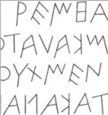
- In the 5th century BCE (Early Greek), the Greeks adopted the Phoenician system, which consisted of 22 letters, and organized the words into horizontal loads and rows. The Greeks read from left to right and then from right to left to right, and the letters were reversed when read from right to left.
Fig 1.3.4 Early Greek
These early Greek letters were drawn freehand and had no syrups, nor the informal entry and exit strikes left by the relaxed and fluent writer. They were very crude inscriptions, but over time they became thicker, the apertures lessened, and the sheriffs appeared.
- The way letter forms were developed today, or during the turn of the century, 20th century, or the dawning of movable-type, were based on how writing was written. So Roman unseals, Roman letters became more rounded and could be written faster.
Fig 1.3.5 Roman Uncials

- In England, the uncials evolved into a more slanted and condensed form, but the Carolingian Handwriting Reform improved writing on the European continent.
Fig 1.3.6 English Half Uncials, 8th C.
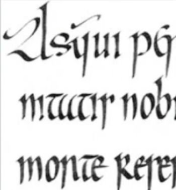
- After the fall of the Roman Empire, Europe was in the Dark Ages and handwriting was in diverse regional styles. The Carolingian Minuscule was established under the direction of Alcuin of York and standardized language, pronunciation and spelling as well as writing conventions, capitals and the start of a sentence.
Fig 1.3.7 Carolingian Minuscule
Emperor Charlemagne standardized writing in Europe by
dictating certain standards upon all the subjects that were under Christendom then. This style became the basis for the humanistic writing of the 15th century, which in turn became the basis for our lowercase Roman type. - Gothic was the culminating artistic expression of the Middle Ages, occurring roughly from 1200 — 1500. The term Gothic originated with the Italians who used it to refer to rude or barbaric cultures north of the Italian Alps.
Fig 1.3.8 Black Letter 12-15 C. CE
Black letter condenses the line spacing and letter spacing, reducing the amount of costly materials in book production.


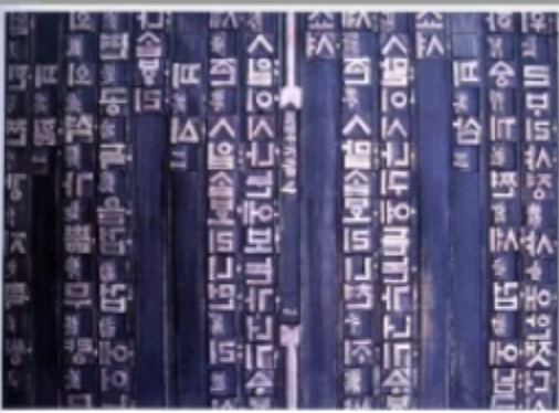
- The Movable Type from 11 C. — 14 C. is the printing (woodblock) that had already been practised in China, Korea and Japan.
Fig 1.3.9 Movable type
The earliest known printed book is the Diamond Sutra 16th Scroll with the World's first printed illustration. China had attempted to use movable type for printing but was unsuccessful due to the large number of characters and the material used.
The Koreans established a foundry in late 14 C. to cast bronze and allowed the dismantling and resettling of text, which meant they could have sentences and then break them up into different sentences.
The Koreans would succeed where the Chinese failed with the creation of the new script Hangeul.
The Koreans established a foundry to cast movable type in bronze in the late 1300s, several decades before the earliest printing in Europe.Fig 1.3.10 Records of China attempting the movable type.

- Why do we talk about Greek influence on Rome, but not Egyptian or Near Eastern influence on Greece?
The Western community sometimes does not give full credit to Egyptian influence on Greece, because it became out of style to credit Africa or Africans with anything of value, and therefore Greece and Rome were elevated over much older, much more influential civilizations.
Max Mueller, one of the proponents of the Indus Valley Civilisation, never visited India and therefore posited views that were self-serving. This is an example of how the European academic process works - great to create the discipline of Dollar G so endure.
They posited that would show Western superiority and it would serve the colonial mentality at that time, but the damage has been done because Max Mueller's work has been quoted in many different literature and many different critically evaluated peer-reviewed journals.
- Handwriting
With the Digital Revolution, the West began digitizing many of its historical creations and type foundries created a market and sold licensed them. With the colonization of the East by the West, much of the heritage and cultural practices in literature, arts and crafts, languages and scripts were halted or stunted.
Eastern developments in handwriting started with Phoenician letters and continued with Aramaic, Nabataean, Early Arabic, Modern Arabic, Syrian, and Modern Hebrew.
The Chinese script also evolved, from the Oracle bone right to the seal scream to the clerical script, traditional and simplified scripts.


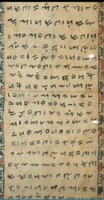
- The oldest writing found in the "Indian" subcontinent is the Indus Valley Civilization (IVC) script, which is 3500 to 2000 BC.
Fig 1.3.11 IVC script
The IVC script in seals is from the Manga, Darrow and Harappan civilizations, which are between Pakistan, Afghanistan India, mostly between Pakistan and India. The Shaniyah civilization was extremely advanced, with City Planning, Drainage, Sanitation systems, Water collection pools, and other things.
In advanced civilisations, such as Chinese civilization and Egyptian civilizations, writing systems have been developed for a long period. - The Bromley Script is one of the earliest writing systems, developed in India about 450 to 350 BCE.
Fig 1.3.12 The Brahmi script
All modern Indian scripts and several hundred scripts found in Southeast Asia are derived from the Brahmi script, which is still much debated. However, there was much cross-cultural exchange during this period.


- Southeast Asia's oldest writing system was the Pallava script. It was highly influential, becoming the basis for writing systems across Southeast Asia.
- Nusantara, which is this area and region, never had a writing system of its own, but the Kawi script, which is based on the Nagari scripts, was used by ancient kingdoms in the Malay Peninsula to write all Malay language.
The Laguna copperplate inscription was written in Kawi, translated as "The bearer of this debt along with his children Lady Angkatan and Bukah was cleared of death by the rule of Tondo."Fig 1.3.13 Laguna Copperplate Inscription
Indonesia has a great number of historical writing systems. We will look into the scripts of the communities that assimilated into Peninsula Malay communities.Fig 1.3.14 Incung from Kerinchi. - Jawi, the Arabic-based alphabet that we all know was introduced along with Islam. However, it took a while for Jawi to supplant the script, so there were still many other scripts being used during that particular period in time.
A record of a female Batak slave to a British resident was found, and it gives more insight into our history. Unlike Indonesia, we don't have a huge wealth of pre-Jawi inscriptions and writing, which is part of the reason why some people ignorantly claim that Jawi does some assembly.Fig 1.3.15 Record of a female slave to British


- In modern Malaysia, Jawi is of great importance because it's the script used for all our famous works of literature. Every hikayat and Malay charm book is written in Jawi.
Fig 1.3.16 Manuscript from the 19th century

- These scripts allow you to be the first to digitize your scripts and make it an actual phone that can be used in a Unicode platform or whatever platforms that are existing. So study handwriting because all digitized letter forms are derived from hand.
- We study handwriting because the first mechanically produced letterforms were designed to directly imitate handwriting.
For decades, Asia in the East has neglected much of its written heritage. However, with the advent of computer programmers in large numbers in India, and China, we are starting to see the proliferation of indigenous scripts on phones, tablets and computers.
- Software giants like Google are producing more vernacular scripts and multi-script typefaces to cater to situations where the written matter is communicated in a vernacular script or vernacular and Latin script. India is making great headway in doing this.
Fig 1.3.17 Baloo: A perfect blend of pointy paws in a coat of fur.

- Indonesian S. believes that more historical texts can be digitized and that new scripts, which are nearly ready but not being used, can be created.
- Malaysian Muthu Nedumaran was one of the first to create a system that allows you to type vernacular languages on your phone. He is now working with other countries to allow them to do the same.
The local organization Huruf has looked into vernacular typefaces, including hand-painted type letterings, and is trying to use that as a basis to inspire and create fonts with a very Malaysian look to them.
There is great progress being made there in India with the Ek Kay organization and the Indian Type Foundry, and hopefully, within the next couple of years, we'll have our type boundaries where we focus on native scripts and vernacular letterings.
- South Asia has increased awareness of methods used and approaches taken by larger neighbours like India, and the knowledge behind them is more accessible to geography theories. So creativity and originality are properties that are most often intertwined.
- Young designers should look inward and examine the histories of civilizations and cultural communities to develop on them instead of blindly appropriating cultures and developments that have no context, relatability and relevance.
- The final quote of the lecture: "Looking behind gives you context. Looking forward gives you opportunities." — Vinod J.Nair
WEEK 4
Why do we need to design a typeface?
Xavier Dupré (2007) suggested two reasons for designing a typeface:
- the type design carries a social responsibility to improve legibility
- the type of design forms an artistic expression
Adrian Frutiger was a renowned 20th-century type designer, and his valuable contribution to typography includes the typefaces Universe and Frutiger amongst a few. His namesake, typeface Frutiger was designed by the Swiss type designer Adrian Foutiger in 1968 specifically for the newly built Charles De Gaulle International Airport in France.
 |
| Fig 1.4.1 Typeface Frutiger |
The purpose of the new typefaces was to create a clean, distinctive, legible typeface that is easy to see from both close up and from far away. It was also intended to be used for screen purposes.
When designing a typeface, letterforms must be recognized in poor lighting conditions or when the reader is moving quickly past a sign. The use of a blurred typeface to test legibility was an interesting method, but it required more stringent methodologies.
In those days, typefaces were not as readily available, so organizations would commission designers to design typefaces.
Adrian Frutiger received many honours at the University of Varanasi, India, and designed a new Devanagari font for the modern typesetting and printing processes.
Frutiger, surrounded by religious dignitaries and ceremony or regalia, created a typeface based on a script that he didn't understand. The Indian government was trying to industrialize quickly and Friedrich was one of the first to get into this digitization process.
 |
| Fig 1.4.2 Adrian Frutiger at National Institute of Design (NID) |
The Indian government realized that they didn't have enough sets of typefaces, so they approached the National Institute of Design, a very difficult school to get into, and commissioned a Westerner to design a typeface.
Matthew Carter is the son of Harry Carter, a royal designer for industries, contemporary British type designer and ultimate craftsman. Thus, Carter trained as a punch cutter and has gone through the entire gamut of punch settings, including old typeset designs, punch sets, phototypesetting, and digital type settings.
Many of Carter's fonts were created to address specific technical challenges, for example, those posed by early computers. Verdana font was tuned to be extremely legible, even at a very small size on the screen, due in part to the popularity of the internet and electronic devices.
 |
| Fig 1.4.3 Web designers hated him because Georgia and Verdana were among the few fonts they could use. |
In most typefaces, you will find that there are difficulties in distinguishing one letter from the other. Vedana has hints, which were done by another individual, not Matthew Carter per se.
 |
| Fig 1.4.4 Hint of Verdana |
Verdana is a typeface that was adapted by Ikea, to the disdain of many designers. Off-screen, Georgia Verdana also made appearances in print in 2010 and was used by Ikea.
Matthew Carter also designed a typeface called Bell Centennial which was used by the Bell Company AT&T to improve upon the earlier typeface called Bell Gothic.
Matthew Carter designed a type called Bell Centennial that had ink traps to prevent blurriness. The ink traps were covered by the extra ink that flowed due to the paper and the fast printing, and then it eventually looked normal.
 |
| Fig 1.4.5 Comparison between font and printed |
Edward Johnston created the hugely influential London Underground typeface, Johnston Sans, in 1916. It was used by many different entities under the London Underground and eventually set the tone for printed text until the present day.
Johnston's remit was to unite the London Underground group, so he applied the proportions of Roman capitals to his typeface, his inspiration was the Trajan's column, which is sharply cut letterforms.
 |
| Fig 1.4.6 Trajan's column text |
Essentially, Johnston was asked to create a typeface, so he threw away the little serif points and increased the weight of the overall stroke. The result is the font was truly modern yet rooted in tradition, which was then known as the Underground Typeface and later on known as the Johnston Typeface.


Fig 1.4.7 Johnston Sans and the London Underground exit sign
Eric Gill, a student of Edward Johnson, created a typeface called Gill Sans based on Johnston's Underground letter. Monotype people eventually called it Gill Sans and Eric Gill became famous, but nobody knew that it was based on Johnson's typeface.
 |
| Fig 1.4.8 Gill Sans by Eric Gill |
With guilt racked, Edward Johnson later wrote a letter to proclaim that Gill Sans owes all its goodness to Johnson.
Typeface designers are usually humble and focused on the work they do. Gail Sands was a notorious and controversial designer and sculpture artist, and his moral misdeeds made it difficult to use his typefaces.
The general process of type design:
- Research
- Sketching
- Digitization
- Testing
- Deploy
When you understand a purpose, you can analyze other types of pieces that have been designed for that particular purpose, and this helps to design your typeface.
 |
| Fig 1.4.9 Font in traps for generally used when printing on cheap absorbent paper, fast and imprecise printing |
Sketching
Some typeface designers use traditional tools such as brushes, pens, ink, and paper to sketch their typeface and then scan them for digitization. Some designers also use digital tools such as Wacom directly into font design software but this can sometimes impede the natural movement of hand strokes.
 |
| Fig 1.4.10 Sketch of Johnston Sans |
Digitization
There are professional software used in the digitization of typefaces, amongst the leading software are: FontLab and Glyphs App.
 |
| Fig 1.4.11 Glyphs App (left) & FontLab (right) |
There are also designers who use Adobe Illustrator to design or craft the letterforms and then introduce them into the specialized font apps.
The reliability and readability of the typeface are heavily dependent on the counter form, so understanding this part is important.
Matthew Carter explains that the counter form of the letter forms matters in readability.
Testing
Testing is an important component in the design thinking process. Depending on the typeface category, readability and legibility of the typeface become an important consideration, but it is not as crucial if the typeface is a display type.
 |
| Fig 1.4.12 Prototype Stencil by Vinod J. Nair |
Deploy
Even after deploying a completed typeface there are always teething problems that did not come to the fore during the prototyping and testing phases. Thus, the task of revision doesn't end upon deployment.
The rigour of the testing is important so that the teething issue remains minor.
 |
| Fig 1.4.13 Prototype Number plate typeface. |
Typeface Construction
When it comes to the Roman capital, the grid consists of a square and circles, and inside the circle, there is a rectangle that touches the lines of the square in four places. The task of revision doesn't end upon deployment.
Using grades with circular forms can facilitate the construction of letterforms and is a possible method to build/create/design our letterforms. Another letter form that also uses squares is a black letter.
 |
| Fig 1.4.14 Construction grid for the Roman Capital using 8 x 8 cells |
Constructions and considerations:
There are 26 characters in the alphabet, and depending on their form construction, they can be arranged into groups. If you construct one group, you can use the construction parts of the other groups, which helps you design a typeface more quickly.
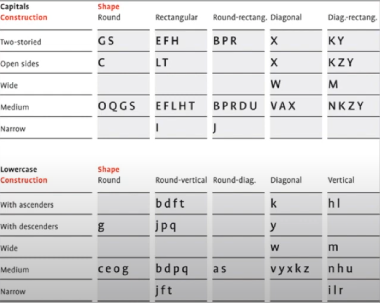 |
| Fig 1.4.15 Letter character grouping |
When designing a new type, it's important to take into account the extrusion of curved and protruding forms past the baseline or cap line.
A visual correction is also needed for the distance between letters, so that the circular form may look smaller than the square form.
 |
| Fig 1.4.16 What you measure is not what you see |
The distance between letters must be altered to a uniform visual white space, which is created by altering the counterforms, and the vertical strokes and creating a rhythm.
 |
| Fig 1.4. 17 Designing rules for letter 'c' & 'e' |
Typefaces can be created in many ways and there are many approaches to it. Depending on the typeface designer, there may be certain intricacies or certain methodologies that he or she employs.
When designing typefaces, the motivation can be intrinsic or extrinsic.
Intrinsic motivation is when the designer has an inexplicable need to design a typeface or identifies a gap that can be solved through type design.
Extrinsic motivation is when the designer is being commissioned or the student designer has been tasked to complete a project that involves designing a typeface. Typeface design is a labour of love.
The final quote for the lecture: "The mindset of a type designer — if clinically studied — might be construed as sick; plagued by an unusual obsession to detail."— Vinod J. Nair
Instructions
Mr Vinod Nair, my module coordinator and lecturer for this semester, provided us with the necessary files including the module information, and reading elements to give us a headstart on this module.
Learning goals:
- Demonstrating an enhanced use of grids, layouts and page flow for effective typographic communication.
- Creating a typeface that reflects its origins
- Creating a symbiotic relationship between image and type and devising methods to enhance the interplay between the two.
- Typographic systems (1 week)
- Type & Play (2 week)
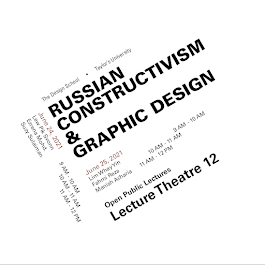
Fig 2.2 Intended final outcome

- Adobe InDesign (200 x 200 mm, Black or one other colour, Limited dots and lines graphics)
Export the final outcome as JPEG (300ppi, 1024 px), PDF with guides and without guides - Type & Play:
Any form to produce a composition of the typeface with the selected theme.
Export the final font design and a movie poster (1024px, 300ppi)
- E-portfolio: gathered information (failures, successes, epiphanies, sketches, visual research, printouts, websites, images, charts, etc)
- E-portfolio: Images/sketches/diagrams/scans captured well and labelled, described and dated. Use PDF and JPEG for final submission
Work Process
Task A: Research
During my research period on choosing one of the contents in the module information, I selected the topic "Russian Constructivism and Graphic Design". Referencing the article link provided in the assignment brief, I'm able to conduct a brief visual research on what graphics and fonts are suitable for the following topic. |
| Fig 3.1.1 Movie poster for Ninich, by Vladimir and Georgii Stenberg, 1927 |
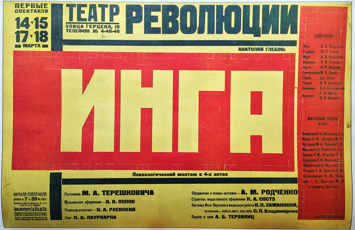 |
| Fig 3.1.2 Playbill for Inga, staged by the Theatre for the Revolution, Alexander Rodchenko, 1929. |
For more information on the topic, click the redirect buttons below:
Russian Constructivism and Graphic Design by Creative Pro
In summary, the visual design used in Russian graphic prints mostly consists of bold and contrasting font styles. This gave me a guideline on how to design my typographic systems that can associate with the contents.
Keywords for the Task A design:
- San serif or blocky serif fonts
- Bold colour contrast combo such as black, white, red, yellow and more.
Task A: Initial Work Progress
The design sketches for typographic systems:
- Axial system
- Radial system
- Dilatational system
- Random system
- Grid system
- Bilateral system
- Modular system
- Transitional system
 |
| Fig 3.2.1 Ideas sketch in Procreate on 3 May 2024 |
Working on digitalizing the outcome, I've made two potential outcomes of each system and finally made a comparison between the two designs.
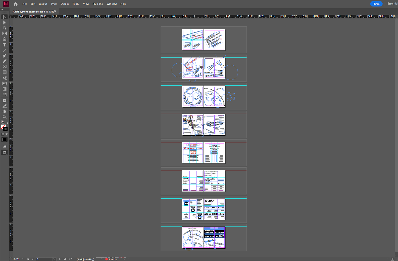 |
| Fig 3.2.2 Progress in Adobe InDesign |
 |
| Fig 3.2.3 Both initial versions of the axial system on 4 May 2024 |
First radial system design
 | |
|
 | ||
|
 |
| Fig 3.2.6 Both initial versions of the dilatational system on 5 May 2024 |
 |
| Fig 3.2.7 Both initial versions of the bilateral system on 5 May 2024 |
 | |
|
 |
| Fig 3.2.9 Both initial versions of the modular system on 6 May 2024 |
 |
| Fig 3.2.10 Both initial versions of the transitional system on 6 May 2024 |
Task A: Eliminations & Adjustments
Only one of the designs can be selected for each typographic system. Final selection and adjustments
 |
| Fig 3.3.2 Layout 1 was selected as the final design on May 7 2024 |
Dilatational system
 >>>
>>>
 |
Fig 3.3.4 Layout 1 was selected and minor adjustments on May 7 2024 |
Bilateral system
 |
| Fig 3.3.5 Layout 1 was selected and minor adjustments on May 7 2024 |
Grid system


 |
| Fig 3.3.7 Layout 2 was selected as the final design on May 9 2024 |
 |
| Fig 3.3.8 Layout 2 was selected as the final design on May 9 2024 |
Task A: Final Outcomes


 |
| Fig 3.5.1 Font design A - "Scales" on 12 May 2024 |
After extracting the letterform out of the patterns, I also made another font design for another image I found on the Internet, and the pattern interested me.
 |
| Fig 3.5.2 Font design B - "Rattan mat" on 14 May 2024 |
Thus, I distorted the stem of the font to make it appear bent.
 |
| Fig 3.5.3 Final type design Before & After |
This is the first version of my movie poster, after getting feedback from Mr Vinod. He only mentioned some minor issues with the type design, and he's pleased with the other poster elements.
 |
| Fig 3.5.4 Movie poster version 1 "The Vowl" on 14 May 2024 |
 |
| Fig 3.5.5 The final version of movie poster 16 May 2024 |
Here's the link to the PDF file of the movie poster "The Vowl" as it's too large to preview :P
PDF - The Vowl movie poster
|
| Fig 3.6.1 The final version of movie poster 16 May 2024 |
Lecturer's Feedback
For the extraction of the image, is it representative of the characteristics of the image?
Specific feedback:
Be mindful that the final design needs to retain its original characteristics
Integration of design with opacity. It's important to create a separation, but too much of it creates isolation instead.
Specific feedback:
My reflections
I've actually learned quite a lot of things about the common typographic systems that can be seen in most of the designs.
My further reading

Typographic Systems by Kimberly Elam - Reading Report
Week 1: Introduction and Overview of Typographic Systems
In the first week of reading Kimberly Elam's "Typographic Systems," I focused on the introduction and the initial overview of the fundamental principles of typographic systems. This book begins by establishing the importance of structure in typographic design which she emphasized that a clear system can guide the designers and ensure visual coherence and readability.
My summary:
1. Introduction to Typographic Systems :
- The author explains the necessity of typographic systems, describing them as frameworks that organize type to communicate effectively. She stresses the importance of consistency and the impact of systematic design on visual communication.
2. Modular Systems :
- A modular system involves breaking down the design into smaller, repeatable units. This system can create harmony and flexibility in layout design. Elam has provided some examples to illustrate how modules can be used in various contexts, such as grids and patterns.
3. Grid Systems :
- The grid system is a cornerstone of typographic design. The author shows how grids can structure content logically and aesthetically. She discusses different types of grids, including manuscript grids, column grids, and modular grids, explaining their applications and benefits.
Week 2: Detailed Exploration of Specific Systems
This week, I delved deeper into specific typographic systems, exploring their unique characteristics and applications.
My summary:
1. Axial Systems :
An axial system is a system that arranges elements along an axis, creating a dynamic flow and visual interest. The author illustrates how axial systems can be used to lead the viewer’s eye through the design in a controlled manner.
2. Radial Systems :
A radial system is a system that organizes elements radiating out from a central point. This approach can create a sense of movement and energy. The author discusses various ways to implement radial systems, from simple radial arrangements to more complex overlapping patterns.
3. Dilational Systems :
The dilational system involves the expansion and contraction of elements, often used to convey a sense of rhythm and variation. The author highlights some examples from posters and book designs where dilational systems add depth and dimension to the layout.
Week 3: Advanced Systems and Their Applications
The third week’s reading focuses on more advanced typographic systems and their practical applications in design.
My summary:
1. Random Systems :
- Random systems introduce an element of unpredictability, creating dynamic and often surprising visual results. The author explains that while these systems may appear chaotic, they require careful planning and a keen sense of visual balance.
2. Transitional Systems :
- Transitional systems bridge different typographic styles and structures, allowing for smooth transitions between various elements. The author discusses how to manage these transitions to maintain coherence while introducing variety.
3. Bilateral Systems :
- A bilateral system balances elements on either side of a central axis, creating symmetry and stability. The author provides examples from editorial design and corporate branding, demonstrating how bilateral systems can evoke a sense of order and professionalism.
Week 4: Practical Application and Case Studies
In the final week, I examined practical applications and case studies to see how the theoretical concepts are applied in real-world design projects.
My summary:
1. Case Studies :
- The author presents various case studies that showcase the implementation of different typographic systems. These examples highlight the thought process behind each design and the impact of typographic choices on the overall effectiveness of the communication.
2. Practical Tips and Techniques :
- The book concludes with practical tips and techniques for applying typographic systems in everyday design work. The author provides advice on selecting appropriate systems for different projects, integrating typography with other design elements, and troubleshooting common issues.


Comments
Post a Comment