Design Principles Task 1 Exploration
Melvin Yung Khun Yew | 0357241 | Bachelor of Design (Hons) in Creative
Media
GCD60804 Design Principles
Exploration on UNSDG
(United Nations Sustainable Development Group)
 |
| Fig 1.1 UNSDG |
These are the jump links to each part of this portfolio
Lecture
Design principles
- Gestalt theory
► "Gestalt refers to "shape" or "form" in German.
► Gestalt principles or laws are rules that describe how the human eye perceives visual elements.
► It shows how complex scenes can be reduced to more simple shapes.
► The Principle of Similarity states that the human eye tends to perceive similar elements in a design as a complete picture, shape, or group, even if those elements are separated.Fig 1.2 From the lecture video by Mdm Yip Jin Chi
The Principle of Continuation states that the human eye follows the paths, lines and curves of a design, and prefers to see a continuous flow of visual elements rather than separated objects.Fig 1.3 From the lecture video by Mdm Yip Jin Chi
The Principle of Closure states that the human eye prefers to see complete shapes, even if the visual elements are not complete, the viewer can perceive a complete shape by filling in missing visual information.Fig 1.4 From the lecture video by Mdm Yip Jin Chi
The Principle of Proximity is the process of ensuring related design elements are placed together.
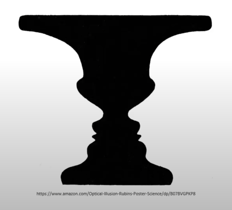
The Principle of Figure/Ground states that objects are instinctively perceived as being either in the foreground or the background.Fig 1.5 From the lecture video by Mdm Yip Jin Chi
The Law of Symmetry and Order states that elements that are symmetrical to each other tend to be perceived as a unified group.Fig 1.6 From the lecture video by Mdm Yip Jin Chi - "Gestalt psychology of visual perception tells us that there are different ways to see the world. Gestalt teaches us to either see the smaller parts or the bigger picture. Basically, the bigger picture is the sum of its smaller parts. the easier way to see it is the smaller parts form the bigger picture." — Dr Charles
Gestalt theory is a design composition which means to organize visual elements into groups or unified wholes. - Contrast
The juxtaposition of strongly dissimilar elements. The visual experience would be monotonous without it.
The contrast principle is applied in visuals when two or more visual elements in a composition are different. It can exist in various forms of visuals such as size, shapes, colours and even more. It allows to grab the viewer's attention and easier digestion of visuals. Contrast is also important in separating, connecting and complementing visual elements together to create a coherent design. - Emphasis
Emphasis is a design principle that makes an area or an object stand out by its size, texture, colour, shape and more. It is used to create dominance and focus in a design work.Fig 1.7 From the lecture video by Mdm Yip Jin Chi - Balance
Balance is all about the stability of a visual (distribution of visual weight), it includes balances such as symmetrical balance, asymmetrical balance and radial balance.Fig 1.8 From the lecture video by Mdm Yip Jin Chi
The Golden Ratio, also known as phi, is a mathematical concept which is representative of perfect beauty over the centuries and also a guide to creating visual balance. It can bring harmony, balance and structure to designers' work.Fig 1.9 From the lecture video by Mdm Yip Jin Chi
The Rule of Thirds is a composition guideline to create more dynamism in a work.Fig 1.10 From the lecture video by Mdm Yip Jin Chi - Repetition
Repetition is a design principle of visuals by repeating a single element such as lines, points or more. Repetition works with repeating patterns and creates rhythm within the work.
Variety is about a change or slight difference in elements to keep rhythms exciting and active and avoid monotony at the same time.
The pattern also increases visual excitement by enriching surface interest.Fig 1.11 From the lecture video by Mdm Yip Jin Chi - Movement
Movement is a design principle of visual that makes one's eye move from one point to another. One popular artwork that represents this design principle is "The Starry Night" by Van GoughFig 1.12The Starry Night — Van Gough
To add additional info, the movement principle can also achieve rhythm in the design. - Hierarchy
The choreography of content in a composition communicates information and conveys meaning. It directs viewers to the most important information first and identifies the navigation through secondary content.Fig 1.13 From the lecture video by Mdm Yip Jin Chi Fig 1.13.1 This is how visual hierarchy works for typography that focuses on the scale and proportion of the text to control the flow of view. - Alignment
It's the placement of elements in a way that edges line up along common rows or columns, or along a common centre. It creates a sense of unity and cohesion, which contributes to the overall artwork aesthetic and perceived stability.Fig 1.14 From the lecture video by Mdm Yip Jin Chi - Harmony & unity
Unity measures how well each element works together in harmony to communicate with the viewer.Fig 1.15 From the lecture video by Mdm Yip Jin Chi - Scale and Proportion
It's all about the size of design elements, which is the size of one object with the other objects in a design or artwork.Fig 1.16 From the lecture video by Mdm Yip Jin Chi - Symbol
A symbol is a sign, shape or object that is used to represent something else to provide or convey information.
Symbols can be separated into different types:
1. Figurative representations
2. Non-figurative representations > Visuals, Graphic symbols (pictorial, abstract, arbitrary)
Pictorial symbols
Abstract symbols
Arbitrary symbols - Word and image
The words and images that work together in design are important as they can include critical thinking or convey messages along with the creative thinking of the people to others. They can further enhance and strengthen the core purpose of designs with the right words and image which is communication.


Instructions
Mdm Yip Jinchi who's my module coordinator, gave our class
a quick brief on the module information about the upcoming assignments, marked
as an open-ended assignment with continuous progression to form a limitless
product/design.
MIB - Module Information Booklet
Work Process
In conjunction with the current ongoing wars and conflicts around the world, I've selected the goal I would like to target which is...
Goal 16: Peace, Justice and Strong Institutions
Brief description of the 16th goal
The 16th goal on the UNSDG website talks about peace, justice and strong institutions, which is the one goal for all nations to promote peaceful and inclusive societies for sustainable development, provide justice accessibility for all citizens to fight inequality in society and construct effective, accountable and inclusive organizations for people to work and connect together.
The reason I presumed this is one of the important goals the world needs to achieve together for a better future for us and the latter generations. Nowadays, there's a lot of ongoing war all across the nations. The most viral war ongoing right now includes the Ukraine-Russia conflict, the Israel-Palestine war and even the racial conflict between whites and blacks in America (Black Lives Matter protests) that became popular in the year 2020. No matter the political warfare, civil war or modern-era social media war, the conflict between governments and societies rains chaos into our daily lives, bringing physical harm (economy, properties etc.) or mental disruption (concern, mental distress, panic etc.) or worse both at the same time.
Thus I found an artwork that suits the goal:
 |
| One Love Artist Name: Emily Deechaleune Year: 2015 Medium: Watercolour |
There is no further information on the artwork as the data on the webpage is invalid. Here's the source I took info from:
Threads, E. (2015, July 24). Say hello to the internets most viral Artist. Electro Threads. https://electrothreads.com/blogs/news/38870721-say-hello-to-the-internets-most-viral-artist-emily-deechaleune
You asked me why I chose this artwork in conjunction with the goal?
This fabulous work of art contains visual elements of the peace symbol and the Earth, which act as the main focus of this artwork. The peace symbol was originally designed by Gerald Holtom in 1958 for the British Campaign for Nuclear Disarmament. Nowadays, this symbol is widely known as the peace sign which is used in different visuals to convey a direct and clear message.
This artwork also clearly shows the Earth when looking at a smaller perspective and the peace sign in the bigger picture. The selection of vibrant rainbow colours further complements the beauty of achieving world peace, with the meaning of hope and joy. The brush stroke fonts give out vibes of human-created work, which makes the words more lively and expressive compared to the uniform, machine-like fonts. All of these elements are what make this artwork successful in communicating the importance of love in attaining worldwide solace.
This artwork also clearly shows the Earth when looking at a smaller perspective and the peace sign in the bigger picture. The selection of vibrant rainbow colours further complements the beauty of achieving world peace, with the meaning of hope and joy. The brush stroke fonts give out vibes of human-created work, which makes the words more lively and expressive compared to the uniform, machine-like fonts. All of these elements are what make this artwork successful in communicating the importance of love in attaining worldwide solace.
(150 Words)
From the testimony of the artist, she states that her art style consists mainly of mandala/zentangle art and she says that the process of creating them is interesting and meditating. Later it becomes a form of relaxation for her to let her mind wander as she creates artworks.
From the testimony of the artist, she states that her art style consists mainly of mandala/zentangle art and she says that the process of creating them is interesting and meditating. Later it becomes a form of relaxation for her to let her mind wander as she creates artworks.
 |
| Mandala/Zentangle art charvi ashtekar. (2022, April 6). Zentangle art || Doodle patterns || Zen-doodle [Video]. YouTube. https://www.youtube.com/watch?v=2vdcq6cmih4 |
Upon further analysing this artwork by Emily Deechaleune, I found that she applied different design principles to her artwork in creating victorious work:
- Principle of figure from Gestalt Theory
There are two different views of this poster, which are the colourful Earth and the peace symbol that fully utilises the negative space of the artwork when looking at various perspectives. - Negative Space
In this artwork, I saw that the artist cleverly utilised the negative space of the canvas to introduce two different graphics together without clumping the space. - Contrast
The more vibrant colours of the Earth with oceans and lands are in contrast with the monotonous white colour of negative space to create more interest. - Balance
Symmetrical balance is achieved in the artwork with the same shape and size distributed on both sides of the art. There is also a radial balance in the flowery pattern cropped according to the scale of the lands/nations. - Repetition
The repetition of the expressive pattern adds a layer of uniqueness to the overall artwork, which closely resembles the freedom of creation. - Word and image
The word choice of "LOVE EACH OTHER" and "WORLD PEACE" supports the messages of this artwork the artist intended to bring up. The little stickman figure beside the word acts as a nice touch to the typography, which represents the childish drawing by pure-hearted children. - Symbols
The arbitrary symbol of a peace sign is used in this artwork to strengthen the message and allow the viewers to easily comprehend the theme of the artwork - Harmony & Unity
All the visual elements such as the Earth, the peace symbol and handwritten text with little stickmen all point to the same goal of achieving freedom. In this artwork/poster work complement each other with their own definitions in relationships between them to create unity among the visuals towards a single goal.
Feedback
Week 3
Dr Charles provides feedback on the blog about the composition of the page, and the proper usage of different fonts to keep the overall blog page consistent. Apart from that, he suggested that I add more detailed explanations of the principles found in the selected artwork.
Dr Charles provides feedback on the blog about the composition of the page, and the proper usage of different fonts to keep the overall blog page consistent. Apart from that, he suggested that I add more detailed explanations of the principles found in the selected artwork.


Comments
Post a Comment