Typography | Task 3: Type Design & Communication
29.10.2023 — 17.11.2023 (Week 8 - Week 12)
Melvin Yung Khun Yew | 0357241 | Bachelor of Design (Hons) in Creative
Media
GCD60104 Typography
Task 3
This portfolio consists of:
Click on the link to jump to that part of the portfolio↑↑↑ Back to top ↑↑↑
INSTRUCTIONS
Task 3 (30%) - Individual: Type Design & Communication
Coming up with the last task of my first semester, I was assigned
to design a limited number of Western alphabets and start off by
choosing an existing font design to set the research and development
direction. Thus, I initiated my final task by studying one of my
favourite fonts from the 10 fonts given by the lecturers, Gill Sans.
Submission in an A4 size poster
Tasks such as:
- Designing text O, D, H, N, and G with the hallmarks of a good typeface: subtlety or character, presence, legibility and readability.
- Further design and creating letters o l e d s n c h t i g, . ! #.

- To develop the ability to construct a readable and legible font.
- To develop the ability to design a font with consistent characteristics premised on research and analysis.
Detail dissection of selected font: Gill Sans

|
| Uppercase letters O, D, H, N and G |

|
| Lowercase letters o, d, h, n and g |
↑↑↑ Back to top ↑↑↑
Work Process

|
| Final selection of font design |
After the feedback session with my lecturer Ms Hsin Yin, I got to understand the professional's perspective on font design and I came up with my improvised ideas for her to give the green light to move on to the next step.

|
| The first version of the font design |

|
| The tail comparison of the letter g |

|
| The first version of the font presentation |
-
Longer end serif
-
A thinner stroke on the shoulder part of the letters
-
Broader top and longer exclamation mark
-
Revamped hashtag
-
Enlongated serif on letter t


|
| Second refinement font design |
-
Reduced stroke width of exclamation mark
-
Design consistency on the letter i
- The thinner horizontal stroke of letters for visual balance


|
| Final font design with measurements. — 11/12/2023 |

- When importing the font, go to Preference > Paste & Duplicate and click on Import original position: prefer AI vector format.
- Select the "Keep position if available" under the Keep artwork size section.

|
| (0,0) position on the global ruler for importing to FontLab |

|
| Letters imported in FontLab |

|
| Sidebearing adjustment following the chart |


|
| Font poster —17/12/2023 |
↑↑↑ Back to top ↑↑↑
Final work

|
| Final Type construction in Adobe Illustrator JPEG |


↑↑↑ Back to top ↑↑↑
FEEDBACK
Week 7 :
General Feedback
- Be careful not to use italics in a whole body text, especially in paragraphs. Moreover, be mindful of the little details in your work in the future.
Week 8:
INDEPENDENT LEARNING WEEK
Week 9:
General Feedback
- For now, focus on exploring the writing and set aside the drawing part.
- Set baseline, height and x-height, ascender and descender space when writing letters.
Specific Feedback
- Small details added to the font make it interesting. As from option 2, I can see it has some reference with the Blackletter font diamond style. Sometimes you can just copy a style from another font by just changing the type of the brush used to write it.
Week 10:
Specific Feedback
- Ms Hsin Yin - Well structured and nice consistency of the design style, but there are some problems with the hashtag bar (Try to move the upper bar right side and reduce the overall weight of the stroke.) Adjust the shoulder of the font
- Mr Vinod - Can you do me a favour? Increase the width of the upper part of the exclamation mark while maintaining the width of the lower part.
Week 11:
Specific Feedback
The stem of the letter t seems too high, you may need to adjust it below the cap height.
We tend to have an optical illusion of the strokes, where the thicker vertical stroke and thinner horizontal stroke can make the whole letter look more balanced than with the same width.
The thick stroke of the exclamation mark makes it too prominent from the rest of the letter, slightly adjust the width of the stroke for better result.
The hashtag symbol is a little high, you may need to adjust it so that the hashtag symbol matches the lowercase letters, be wary of the fact that there is a thing called contextual alternates. You can access it in Adobe Illustrator in the OpenType section of Type Window.

Week 12:
General Feedback
When importing the fonts to FontLab, make sure the letter is merged together in Illustrator.↑↑↑ Back to top ↑↑↑
REFLECTIONS
-
Experiences
In the final weeks of my last assignment for Typography in semester 1, I truly experienced the thrill of creating a new font following my desire. The amount of specific details required for the font really shocked me while I was learning important stuff for creating a font at the same time. From the visual illusions due to the relationship between the shapes to the letters to the contextual alternatives, I had some fun trying out this assignment.
-
Observations
Taking a look at different font families with different designs, such as Blackletters, Universe and more, I noticed similar visual characteristics that follow certain visual rules to make the overall text look balanced.
-
Findings
After a thorough observation and research, I found that the circle shape stroke in the letters like the letter “o c e” are always a bit larger than the other characters to counter the visual illusion and make it seem that they have the same weight. Not only that, I realise that the composition of the letters follows the guidelines for example baseline, median line and ascender/descender line.
↑↑↑ Back to top ↑↑↑
FURTHER READING
Week 7
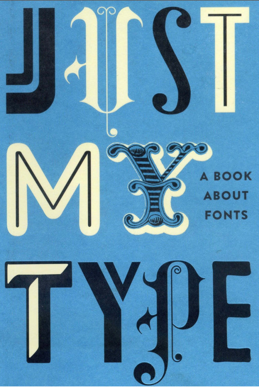
The book I selected to read in week 7 is Just My Type by Simon Garfield.
After reading through the chapters of the book, I came to a conclusion for each chapter based on my perspective.
Third chapter: "Legibility vs Readability"
Legibility vs. Readability:
- Cooper Black illustrates the difference between legibility and readability, being legible but less readable at small sizes.
- The analogy of font-as-couture is drawn, emphasizing the artistic and practical considerations in type design.
- The constant evolution of type design challenges traditionalists, with beauty requiring discipline for practical use.
Preferences in Typefaces:
- Surveys indicate a preference for bold faces over regular ones, though their legibility remains similar.
- Serif and sans-serif faces are equally legible, with a preference for thinner serifs. Larger counters enhance legibility, especially at smaller sizes.
Key Factors in Letter Distinction:
- Research suggests that distinctive strokes and clear distinctions between letters enhance readability.
- The top half and right side of letters play a crucial role, serving as flagposts for the eye to anticipate and confirm information.
Factors Affecting Readability:
- Readability is influenced by the distinctiveness of letters, context within sentences and paragraphs, regular paragraphs, sufficient margins, and an acceptable line length.
- Adequate space between letters and lines, contrast between thick and thin strokes, regular proportions, variety in width, and upper-half readability contribute to optimal readability.
Challenges in Type Design:
- Designing a text font requires attention to subtle details, with letters appearing equal in height but often having subtle differences.
- Optical illusions, like the dot of a dotted 'i,' challenge the perception of equal height in letters.
Week 8
Fourth chapter: "Can a font make me popular?"
- This chapter talks about Matthew Carter, a highly respected type designer, who travelled to London in 2009 for a lecture on typeface revivals. He has dedicated his working life to type design and has a keen eye for type details, often noticing inaccuracies in films regarding historical fonts.
Changing Perception of Typography:
- Graphic design's popularity at art schools coincided with an increased awareness of typography.
- People now express preferences and feelings about typefaces, signalling a shift in perceiving and appreciating typography.
Matthew Carter's Career and Contributions:
- Matthew Carter, known for his eloquence and classic style, is the creator of widely used fonts such as Verdana, Georgia, Jannon, Bell Centennial, ITC Galliard, and Tahoma.
- His fonts are employed by major publications and companies globally, making him one of the few type of designers making a substantial living from the trade.
Public Awareness and Preferences:
- Over time, public awareness of typefaces has grown, but there is often a lack of realization that human agency is involved in creating fonts.
- Carter's encounter with people familiar with Verdana exemplifies how widespread fonts can become, leading to mandatory usage in some companies.
Subjectivity in Font Choices
- People occasionally inquire about choosing typefaces for friendliness or popularity, but Carter emphasizes the subjectivity of font preferences.
- Carter's own taste centres around suitability and meeting the expectations of employers, and he is proud of being described as the most widely read man in the world in a New Yorker profile.

Importance of Historical Knowledge in Type Design:
- Carter's intricate knowledge of type history is a crucial factor in his success, especially in the realm of type revivals.
- The disappearance of manual labour due to computers may have led to a loss of the rounded worldview that craft brings, as demonstrated by Carter identifying a fake poster based on typeface origin.
Week 9
Fifth chapter: "The HANDS of UNLETTERED MEN"
Publication of "A View of Early Typography Up to About 1600" (1969):
- Written by Harry Carter, Matthew Carter's father.
- Explored early typography history in Monotype Bembo.
- Harry Carter, initially a barrister, became chief designer at His Majesty's Stationery Office
Fifteenth-Century Printing Boom:
- Technological advancements led to a collision between typefounders, printers, publishers, and readers.
- Venice emerged as a centre of trade with over fifty competing printers.
Innovations in Typeface Design:
- The da Spira brothers introduced a flowing and orderly face in Venice, representing the first modern printed font.
- Nicolas Jenson refined styles, and Aldus Manutius invented the semi-colon, contributing to the modern book trade.
- Francesco Griffo created the ancestor of the classic Bembo font and introduced italic type around 1500.
Concerns and Criticisms:
- Erasmus noted the ease of becoming a printer, leading to a printing "gold rush."
- Concerns arose about the dumbing down of knowledge with the proliferation of books, including lustful texts.
"The Fount of All Knowledge" and Knowledge Accessibility:
- The phrase originated, symbolizing the vast knowledge available through printing.
Printing in London - William Caxton and Wynkyn de Worde:
- William Caxton set up a printing press in Westminster in 1476.
- Caxton's influence on the standardization of English was significant.
- Typographic errors were present, but Caxton's impact on English language development was notable.
- Wynkyn de Worde, Caxton's successor, expanded printing innovations in Fleet Street.
Sixteenth-Century Transformations:
- The revolution in movable type delighted common readers but raised concerns in the church.
- Significant transformations occurred just fifty years after Gutenberg's invention.
Week 10
Sixth chapter: "The Ampersand's Final Twist"

Historical Ampersands:
- Marcus Tiro's Shorthand: The first use of the ampersand is credited to Marcus Tiro's shorthand method in 63 BC, combining 'e' and 't.'
- William Caslon's Ampersand: Caslon's ampersand is considered the finest, being difficult to draw but providing aristocratic virtue to a font.
Claude Garamond's Artistic Ampersand:
- Garamond, a French-type designer, allowed artistic expression in his ampersand, incorporating calligraphic roots with a lizard-like ascending stroke on the 'e' portion.
- Garamond's fonts became popular in Europe for two centuries, and his ampersand reflects a unique calligraphic style.
Garamond vs. Caslon:
- Garamond's fonts, classified as 'old-face,' emphasize contrast and movement, making them suitable for a respectable yet warm feel.
- Caslon's fonts from the 1720s established a strong English style with confident serifs and heavy capitals.
Ampersands in Modern Usage:
- Garamond and Caslon remain popular choices today, with Garamond associated with classics like Dr Seuss and Harry Potter.
- The article touches on the international use of the ampersand in various languages.
William Caslon's Legacy:
- Caslon, a former gunsmith, incorporated flourishes in his 'swash' capitals and created an elaborate ampersand.
- Caslon's ampersand, exemplified by the ITC 540 Caslon Italic, is described as impressive, intriguing, and embodying new freedoms.
Ampersands in Branding:
- Ampersands in brand names signify permanence and partnerships, with examples like Dean & Deluca and Ben & Jerry's.
- The article humorously comments on famous pairs like Simon and Garfunkel or Tom and Jerry, suggesting why they might face issues.
Creative Use of Ampersands:
- The article acknowledges the ampersand's creativity, emphasizing its impact on type design and signifying more than just a link.
- A font named 'Coming Together' features 483 different ampersands contributed by designers worldwide, with proceeds supporting charitable causes.
Week 11
Seventh chapter: "Baskerville is Dead (Long Live Baskerville)"
- Lichtenberg is a physicist who hoped to meet type designer John Baskerville.
- Baskerville is primarily a japanner and engraver, but he also enjoys printing and lettering.
- Baskerville's fonts were slender, delicate, and labelled "Transitional", his font bridge the gap between Caslon's "English Old" and Didot's "Modern."
- Baskerville fonts had some distinctive features, such as the upper-case Q with an extended tail.
- The lower-case g had a curled ear, and his fonts were known for their elegance.
- After Baskerville's death, King George III encouraged Lichtenberg to pay a visit to his widow.
- Sarah Baskerville was asking £4,000 for the printing equipment, which included punches and matrices.
- Baskerville's fonts required meticulous care, and despite his innovations, he frequently faced financial difficulties.
- For over 250 years, Baskerville's font has been widely used.
- Despite the criticism, Baskerville's fonts were widely copied and remain popular.
- Baskerville's personality was viewed differently by different people; some saw him as a comedian, while others saw him as slightly possessed.
- Lord Macaulay praised Baskerville's work for creating amazing libraries throughout Europe.
- Benjamin Franklin defended Baskerville against criticism, revealing a sly prank on a detractor.
-
Lichtenberg did not purchase Baskerville's printing equipment, but it
was later acquired by Pierre de Beaumarchais for the Literary and
Typographical Society.
-
The equipment was designed to print Voltaire's complete works, but it
was most likely also used for revolutionary propaganda.
The Uncertain Fate of Baskerville's Remains:
-
Baskerville, who was sceptical of religion, planned his own mausoleum
but was discovered buried horizontally in 1827.
-
His remains were relocated several times before ending up beneath the
chapel in Warstone Lane.
Baskerville's Font Revival and Modern Application:
-
Baskerville's fonts were popular in advertising in the 1950s after
being revived in the 1920s.
-
Baskerville's font was adapted for various composing machines by
major foundries, and it was included in the Apple iPad typeface
choices in 2010.
Week 12
Eighth chapter: "Tunnel Visions"
- Edward Johnston invented it during World War I.
- Used extensively in London at various locations and events.
- Master calligrapher Johnston influenced notable figures such as Evelyn Waugh and Eric Gill.
- At the British Library, I discovered a passion for calligraphy.
- Frank Pick pioneered the Tube and London branding concepts.
- Sought a straightforward, manly font that was unmistakably of its era.
- In 1913, Gerard Meynell introduced Johnston to Frank Pick.
- Eric Gill initially collaborated, and the first letters were written by Johnston in 1915.
- The full alphabet debuted in 1916, aiming for excellence while breaking with traditional spacing rules.
- Posters and information displays make extensive use of it.
- Symbol of London's cultural heritage and well-being.
- The font was modified; a major overhaul was performed in 1979 by Eiichi Kono and Colin Banks.
- The guidelines emphasised the use of New Johnston and discouraged modifications.
- Endured as a result of nonconformity and a radical appearance.
- New Johnston fonts were introduced in 1979.
- Many global subway systems needed more coordination sixty years after standardising London's subway.
- The signage on the Paris Metro evolved; the Alphabet Metro was introduced in the early 1970s.
- The typography on the New York City underground was varied until 1967, when Standard Medium (Akzidenz Grotesk) was chosen.
- Helvetica was first proposed in the mid-1960s and was finally implemented in 1989, unifying New York tube signage.


Comments
Post a Comment