Typography | Task 2: Typographic Exploration & Communication
29.10.2023 — 10.11.2023 (Week 5 - Week 7)
Melvin Yung Khun Yew |
0357241 | Bachelor of Design (Hons) in Creative Media|
GCD60104
Typography
Task 2
This portfolio consists of:
Click on the link to jump to that part of the portfolioLECTURES
Week 5 Understanding
Understanding letterforms
As you can see in the letter below, it suggests symmetry, but in fact, it's not symmetrical. It's easy to see the difference in stroke weights in the letterform and have a unique arc between the bracket and the stem connecting within each other to form a serif.

|
| Baskerville font letter A |
In san-serif fonts such as Univers, the uppercase letter forms may appear symmetrical, but the width of the left stroke is thinner than the right stroke upon closer inspection. This shows the meticulous care of the designer who made these letters with the details that create the illusion of maintaining levels of harmony and expression.
From Mr Vinod's perspective, the action of this design is because of the visual sensitivity of the designers to create dynamics and a sense of delicateness as opposed to the rigid structure of the font if it is designed with equal weight on both sides.

|
| Univers font letter A |
We can see the complexity of each letterform by comparing two different fonts together side by side. A palpable difference in the characters can be seen from the stem and the bowl of the letter

|
| lowercase letter a of Helvetica and Univers font |
This difference in characters can suggest various characteristics presented by the letter alone.
Thus, Mr Vinod also warned us about the dangers of overdesigning a font and
the need to simplify the design and ensure consistency to maintain uniqueness
in a font.
Maintaining x-height
The curved strokes such as the letter "s" must rise above the median and even sink below the baseline to appear the same size as the vertical and horizontal strokes they adjoin.

|
|
Increase the height of the curved stroke |
Form/ Counterform
Just as important as recognizing specific letterforms is developing a sensitivity to the counter form — the space describes and is often contained, by the strokes of the form. The counter form includes the spaces between them when letters are joined to form words.

|
| Counter forms in letters |
Examining the form and counter form in close detail provides a good feel for how the balance between form and counter is achieved.

Note: the sense of the letter "s" holds at each stage of enlargement, while the letter "g" tends to lose its identity, as the individual elements are examined without the context of the entire letterform.
Contrast
Contrast is the basic principle of graphic design that applies directly to
typography.
The simple contrasts produced numerous variations:
small + organic/ large + machined; small + dark/ large + light.


|
| Diagram of different contrast |
Conclusion
Week 6 Screen & Print

|
| Example of good webpage design |
- Operating systems
- System fonts
- Screen and device
- Viewport
- and more...

- 10-point size text for reading at inches distances
- At least 12-point size text for reading at arm's length.
- Open Sans
- Lato
- Arial
- Helvetica
- Times New Roman
- Times
- Courier New
- Courier
- Verdana
- Georgia
- Palatino
- Garamond

|
| The font size of the screen and print medium causes visual differences |

|
| Different pixels in the phone screen and smartwatch screen |


Motion typography emerges as temporal media offers typographers chances to "dramatize" type, for letterforms to become fluid and kinetic.
↑↑↑ Back to top ↑↑↑
INSTRUCTIONS
Task 2 (20%) - Individual: Typographic Exploration & Communication
For the second task, I was assigned to express typographically
one of the contents of my choice, which the available selections are
"The Role of Bauhaus Thought on Modern Culture", "A Code to Build on and
Live By" and "Unite to visualise a better world". Thus, I started to
explore several options for expression and layout to finally execute a
good layout using the knowledge I gained from the first task.
Submission in a 2-page editorial spread of 200mm x 200mm per page.
Tasks such as:
- Text formatting
- Text expression

- To demonstrate the use of grids, layouts and page flow
- To apply the necessary skills and sensibilities for effective typographic communication and achieve good reading rhythm with memorability.
↑↑↑ Back to top ↑↑↑
Work Process

|
|
1st Type expression design |

|
| Layout 1 30/10/2023 |

|
| Layout 2 30/10/2023 |

|
| Layout 3 31/10/2023 |
I intended to use the repeating letters inside "Unite", "Visualise" and "Better" and later combined them together with a letter sharing between the text. It was to symbolise how different words can still be fused with each other with the elements in common between them.

|
| Layout 4 31/10/2023 |

|
| Layout 5 31/10/2023 |

|
| Layout 6 31/10/2023 |

|
| Layout 7 31/10/2023 |
 |
| Final layout 7/11/2023 |
Type Expression
Sub Head
Gill Sans MT Bold Italic
18 pt
22 pt
Body
11 pt
Align Left
Margins
Gutter
↑↑↑ Back to top ↑↑↑
Final work


↑↑↑ Back to top ↑↑↑
FEEDBACK
Week 6 :
Specific Feedback
- I like how you utilize the number to the letter in "Unite". The 1 represents the letter I which also stands for "one together" meaning. Working on layout 5, the lead-in line can be adjusted to have the same angle as the header. Some alignments cant can be made to fix the graphics. The inverted 3 here can show the letter E but somehow from "the better world", it can be easily read as "butter" instead of "better" from my perspective. However, it's worth noting that the 3 works fine too here to replace the E.
Week 7:
General Feedback
- Be careful not to use the italic style in a whole body text, especially in paragraphs. Moreover, be mindful of the little details in your work in the future.
Specific Feedback:
↑↑↑ Back to top ↑↑↑
REFLECTIONS
- Experiences
Throughout the whole second assignment, all I can say is it's a quick one. The combination of the knowledge that I've learned in the first exercise assignments such as the type expression and type formatting are being utilised here to create the final editorial spread in the Adobe InDesign. Thanks to the lecturing by Ms Hsin Yin and Mr Vinod, I began to be aware of all sorts of details to be taken care of such as the widows and orphans in the body text which usually I didn't notice before. This assignment also sharpened my sense to emphasize the reading flow and visual hierarchy to enable easier reading comprehension.
-
Observations
Looking at my classmates' interesting work during class every Tuesday, I saw the improvements and some creative ideas in my peer's products that I hadn't thought of that way before. Some of their work is really an eye-opener for me and somehow refreshes my creative brain juice. For some time I tried to search far and wide for some design samples on how to bring out unity definitions into "Unite" for type expression, just to see a limited range of ideas on them.
- Findings
Because of that, I began to do research on the photos and illustrations on how the unity works and how to resemble them in visual terms. In the end, I believe it is safe to say that a diverse vision is one of the utmost key points in designing successful typographic visuals as throughout the assignment, I came to the conclusion that unity means different groups from different areas still can join hands together without considering dissimilarity between them towards a same goal.
↑↑↑ Back to top ↑↑↑
FURTHER READING
Week 5
The book I selected to read in week 5 is Just My Type by Simon Garfield.
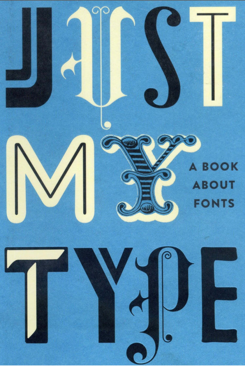
After reading through the chapters of the book, I came to a conclusion for each chapter based on my perspective.
First chapter: "We don't serve your type"
The first chapter of the book talks about the creation history of Comic Sans font. However, it also talks in the sense of applying suitable fonts for copious situations. The father of Comic Sans, Vincent Connare intended to create the font to resemble fun elements as he noticed how unnatural and weird vibes of Times New Roman typeface were used on the instructions of Microsoft Bob which is a software package designed to be particularly user-friendly. In 1994, he realised that the software which was designed to be warm and welcoming to the computer user, was demolished by the traditional and chilly feel of the typeface used inside the software. Therefore, Comic Sans is officially developed and used. (It is called Comic Sans as the design of the font originates from the comic books)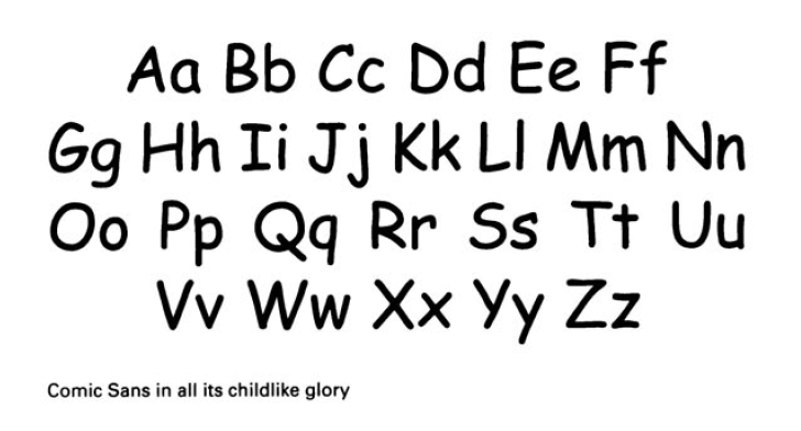
But soon after the Comic Sans font gained its popularity (as it was introduced in Windows 95), the abuse of the fonts in different fields from school textbooks, webpages and even on graves (as people saw the fonts quite funny), caused some disgusting reaction by certain community as the typeface ruined the actual intentions of the content and was called ludicrous of the wrong usage of font.
- be mindful of the mood of the content such as when formality is most required (reports, documents)
- be considerate of what visual information a typeface will bring out (formal, casual, emotional, nostalgic...)
Week 6
Second chapter: "Capital Offence"
-
Type can have genders (Typefaces used for the title of the book)
As the example below, the Arquitectura font is for the male lines because they are tall, solid and implacable (manly). Centaur font for the female lines because it looks like handwritten, thin and thick strokes, and is charming and elegant.
For easier understanding, heavier, bolder, jagged fonts are mostly male while whimsical, lighter curly fonts are mostly female.
Men Are From Mars, Women Are From Venus by John Gray


Comments
Post a Comment