Illustration and Visual Narrative | Task 1
Week 1 - Week 4 (25/9/2023 - 23/10/2023)
Melvin Yung Khun Yew | 0357241 |
Bachelor of Design (Hons) in Creative Media
COM 61304 Illustration and Visual Narrative
Task 1
This portfolio consists of:
Click on the link to jump to that part of the portfolio
Lectures
↑↑↑ Back to top ↑↑↑
Week 1: The Bezier Game
To start the first class, Mr Hafiz introduced us to a little fun game that can
assist us in understanding and being able to utilise the pen tool in Adobe
applications as it is one of the most important tools for drawing and creating
illustrations in later classes and assignments.

Thus I gave it a try:

|
| Outlining circle |

|
| Outlining a car using 12 nodes |
I gave the car challenge another go and got even fewer nodes here:

|
| Outlining a car using 10 nodes |

|
| Outline tracing of shapes provided for the Vormator Challenge |
Week 2: Character Design Basics
Stylized Design
- Iconic
- Simplicity
- Unique
The principle of character design
-
Shapes
Shapes design a character's silhouette to identify a character from one another

|
| Monster Inc. © Pixar, 2001 |
The shapes can add some weight to their personality

|
| Aladdin © Disney, 1992 |
-
Colour
Colour can be used to establish the basic roles of the characters by determining and separating the
basic characteristics of heroes, villains and even background characters.
Colour can even determine psychology by giving out impressions of different emotions.Star Wars Franchise © Disney
Inside Out © Pixar, 2015
-
Emphasis & Contrast
These principles are used for exaggeration to memorate
Colours and shapes are often emphasized and contrasted in a good character design to make them stand outTangled © Pixar, 2010 Inside Out © Pixar, 2015
-
Harmony
Every element (shapes, colours, motifs, patterns) in the design should complement each other
Visual hierarchy and how it reflects the narrative of the characters
Inside Out © Pixar, 2015
-
Expression and poses
Clear visualization expressions (behaviours, quirks, personalities) are important for easier visual appeal to viewers
Inside Out © Pixar, 2015


Week 3: Chiaroscuro
What is chiaroscuro?
- The use of light and dark creates the illusion of
three-dimensional volume on a flat surface.
- Tonal contrast
The purpose of chiaroscuro:
- To increase the scene's dramatic tension by exaggerating the subject's importance using colour or light contrast.

- To create a sensational effect that helps elevate fantastical viewpoints to emphasise the narrative.
- To attract attention by establishing visual hierarchy, the main point of a scene.

- To make the tasteful composition when negative spaces and positive spaces are used to create attractive scenes

References and video suggestions:

Barry Lyndon 1975 - A Cinematic Canvas
https://youtu.be/0cDhRSOCuBE

Chiaroscuro Lighting in Film — Balancing Cinematic Light & Darkness
https://youtu.be/NzCXVfzQ-EI
Adobe Tools Exercise:
Pencil Tool (Shortcut: N)
Pathfinder (Divide)


Fig Outlining and shaping of light and shadow on the pear
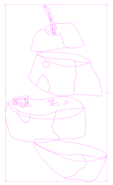

Fig Segmenting and recoloring of the pear
Homework for Week 3: Shadows of anything you favour and cast in on the pear
After careful consideration, I decided to use the portrait photo of a woman in the chiaroscuro exercise folder in Google Classroom and cast the shadows on the pear.

|
| Original woman portrait photo |

|
|
Outlining and shadow selection using pen tool |

|
| Base colour selection of pear |

|
| Finished work |
Week 4 - No class (Lecturer sick leave)
Week 5 - Chiaroscuro
In week 5, Mr Hafiz led us to try tracing out a man's silhouette and
replacing the shadows into images with patterns. Guiding us on how to use
the clipping mask to replace the dark shadows.


Select the reference image and dim the layer to 50% after selecting the
image as a template.

|
| Trace out the outline of the targeted man |
The next step is to compound all the shadows into a single compound path in Object > Compound Path (Adobe Illustrator)
After that, clip the compound path of shadows with the patterned image I
found on the internet which is interesting.

|
And there you have it!

|
|
Clipping mask of pattern on the shadow |

|
| Background darkening to see the details better |
Instructions
↑↑↑ Back to top ↑↑↑
Mr Hafiz gave the class briefing on this whole module and the
module learning outcomes through the online Microsoft Teams
meeting.
Task 1 (20%) - Individual: Exercises
The first task will be exercises that aid and benefit me in gaining theoretical and practical knowledge in illustration and visual narrative to inform and provide me with the necessary experience to take on this module.
The first task will be exercises that aid and benefit me in gaining theoretical and practical knowledge in illustration and visual narrative to inform and provide me with the necessary experience to take on this module.
Submission
Daily in-class technical exercises
Daily in-class technical exercises
Vormator Challenge character
Game card design
Learning goals
- Generate and communicate design concepts and solutions through manual and digital skills effectively and skillfully.
- Use creative thinking skills and methodologies to explore, generate and test a wide range of conceptual ideas.
- Use information and communication technology to source navigate, select, retrieve and manage information.
Work Process
↑↑↑ Back to top ↑↑↑
Vormator Challenger character design
In this challenge, it's the ultimate challenge of my creativity. What
it means by that is that I need to create a character design with
limited shapes provided as shown in the image below.

|
| Vormator Challenge: Shapes |
Using the shapes, I have decided to create a character that portrays a good person's characteristics with the character shape language in mind.

|
|
The Walt Disney: Shape Language |
Circles and triangles are the main base shapes of my character, as I want to bring kindness and reliable characteristics into it. Here is my first attempt at the character design:

|
| Fig 1.1 Hydro Person Design Ver 1.0 — 6/10/2023 |

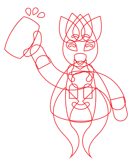
Wireframe of the design version 1.0
I went with the hydro character design to further strengthen the personality of friendly as we know that the water H2O is harmless to us. Thus blue colour becomes the main tone of my character.
In the meantime, I'm working on another character design referencing
Robin Hood.


Fig 1.2 Design 2 — 8/10/2023
However, I found that I was having a hard time visualising the outcome
of this character (characteristics, personality) so I put this 2nd
design aside.
But this 2nd design attempt gave me the inspiration to add the hand
design to the first hydro character. Thus, I began to work on the
design refinement again as I was still not satisfied with the first
version of the hydro character.
Refinements added:
- Curly hair-like design
- Tongue with darker blue colour
- Fine textures and details on the beer tankard
- Legs and shoes
- More detailed hands
- Colour change of the icon on leather aprons

|
| Fig 1.3 Hydro Person Design Ver 2.0 — 15/10/2023 |
Later, I decided to add shadow details to the character to make it
look lively.

|
| Shadows on arms and legs — 1/11/2023 |
Game Card Design

|
| The first version of the game card design |
As I was not satisfied with the first version of the background design, I decided to change the background of the game card based on the medieval tavern as the character is holding a tankard.

|
|
Tavern reference Source from https://stock.adobe.com/search?k=medieval+pub&asset_id=478490472 |
I created the tavern background with a mixture of the shapes provided
by the Vormator Challenge and freeform shapes. Gradient tools are also
used to create the ambient light effect from the candle and the
firepit.


Tavern background design with the wireframe — 1/11/2023

|
| Final product: Pokémon Card — 1/11/2023 |
Feedback
↑↑↑ Back to top ↑↑↑
Week 2
General feedback: Good outline tracing on the Vormator
Challenge shapes
Week 3
General feedback: No particular feedback was given
Week 4
No feedback - no class
Week 5
General feedback: No particular feedback was given
Reflection
↑↑↑ Back to top ↑↑↑
-
Experiences
Even though this Illustration and Visual Narrative class are being conducted online through Microsoft Teams every Monday, I am still able to feel the fun of this module with every lecture and the information I received throughout these 6 weeks of class. Despite this module seems easy on paper, the sheer amount of effort and time one needs to put into it surprised me especially when I was doing this first task. Character design with limited elements and materials really put my knowledge and skill applications to the test.
-
Observation
In my spare time, sometimes I look up on Pinterest watching and admiring other professionals' work. The amount of knowledge and time they put into their work is what I can't imagine. Moreover, Mr Hafiz patiently taught and guided us on the features and functions of Adobe Illustrator, I believe I can see a better version of myself compared to when I was still in the Foundation in Design course at Taylor's College.
-
Findings
I found a lot of cool info that piqued my interest in how to create a successful character design during these 5 weeks of lectures and the practical use of them throughout this first task that requires me to develop a character from scratch. From the principles of character design to the visual effects to further portray moods in scenes, I can get to touch on these pearls of wisdom thanks to the lecturing from Mr Hafiz Zamri.


Comments
Post a Comment