Typography | Task 1: Exercise
25.09.2023 — 29.09.2023 (Week 1 - Week 5)
Melvin Yung Khun Yew |
0357241 | Bachelor of Design (Hons) in Creative Media
GCD60104
Typography
Task 1
This portfolio consists of:
Click on the link to jump to that part of the portfolio↑↑↑ Back to top ↑↑↑
LECTURESWeek 1 INTRODUCTION & BRIEFING
In the first week of my first semester, I met Mr. Vinod and Ms. Low Hsin Yin as my lecturers to guide me in typography class. He provided the necessary information during a lecture to ease me into this module about using the Microsoft Teams application as the main platform throughout the semester. Later he supplied the whole class with several class materials such as the fonts that I would need to use for this semester's assignments. Mr. Vinod was also kind enough to recommend the class multiple books for referencing and learning about typography.
Mr Vinod cleared our minds by introducing and explaining the differences between font and letterform. The font is all the letterform together with the same design language or elements. While the letterform is a single letter with its own unique design.
Main topics during the lecture:
- Usage of laptops for all activities
- E-portfolio instructions & samples (Lectures, Instructions, Feedback, Reflections, Further Readings)
Week 1 DEVELOPMENT (Video Clip)
Early letterform development: Phoenician to Roman
- Phoenicians wrote from right to left same as other Semitic people
- However, the Greeks changed the direction of the writings from left to right (boustrophedon, just like how ox plough from left to right then left and so on.)

|
| Fig 1.1.1 Early reading direction |
- Still, both of their writings do not have letter space or punctuation.
- Etruscan (and later Romans) carvers painted out the letters on the marble before chiselling and inscribing the letter. Because of the tool, there are certain qualities of the stroke such as the change in weight from vertical to horizontal, a broadening of the stroke and the start and the end.

- The letterform had been refined based on the brush stroke.

- Square capitals were the written version that can be found on Roman monuments.
- As in Fig, these letterforms have serifs added to the finish of the main strokes.

- As in Fig 1.1.4, these are the compressed versions of the square capitals (rustic capitals) that allowed twice the amount of words on a sheet of parchment and took far less time to write.
- Although they are easier and faster to write, they were slightly harder to read due to their compressed nature.

- Both square and rustic capitals were typically reserved for documents of some intended performance.
- However, everyday transactions were written in cursive hand in which the forms were simplified for speed.
- It's the beginning of lowercase letterforms.

- Uncials incorporated some aspects of the Roman cursive hands, especially in the shape of A, D, E, H, M, U and Q
- "Uncial" is Latin for a twelfth of anything, thus some scholars believe that uncials refer to letters that are one inch (one-twelfth of a foot) high.
- Uncials have broad forms that are more readable at small sizes than the compressed form of rustic capitals.

- It's a further formalization of the cursive hand, half uncials mark as the formal beginning of the lowercase letterforms.
- The letterforms are replete with ascenders and descenders (2000 years after the Phoenician alphabets)

- Charlemagne who was the first unifier of Europe since the Romans, issued an edict in 789 to standardize all ecclesiastical texts.
- The monks from Alcuin of York, Abbot of St Martin of Tours rewrote the texts using both majuscules (uppercase), minuscule, capitalization and punctuation which set standards in calligraphy for a century.

- In Northern Europe, a condensed strongly vertical letterform known as Blackletter or Textura gained popularity.
- In Southern Europe, a rounder more open hand called the "rotunda: also gained fame.
- The humanistic script in Italy is based on Alcuin's miniscule.
-
1450 Blackletter
The earliest printing type, it is based on the hand-copying style used for books in Northern Europe.
Examples: Cloister Black, Goudy Text -
1475 Oldstyle
It's based upon the lowercase form used by Italian humanist scholars for book copying and uppercase letterforms found inscribed on Roman ruins
Examples: Bembo, Caslon, Dante, Garamond, Janson, Jenson, Palatino -
1500 Italic
It's condensed and close-set to allow more words per page, echoing contemporary Italian handwriting. -
1550 Script
Originally an attempt to replicate engraved calligraphic forms, this class of type is not appropriate in lengthy text settings.
Examples: Kuenstler Script, Mistral Snell Roundhand -
1750 Traditional
A refinement of old-style forms was achieved due to the advances in casting and printing. Thick-to-thin relationships were exaggerated, and brackets were lightened.
Examples: Baskerville, Times Roman, Bulmer, Century -
1775 Modern
A further rationalization of old-style letterforms. Serifs unbracketed.
Examples: Bell, Bodoni, Caledonia, Didot, Walbaum -
1825 Square Serif / Slab Serif
It's a heavily bracketed serif developed for advertising for heavy type in commercial printing.
Examples: Clarendon, Memphis, Rockwell, Serifa
-
1900 Sans Serif
These typefaces eliminated serifs altogether.
Examples: Helvetica, Gill Sans, Franklin Gothic, Futura, Univers
Week 2 TEXT FORMATTING (Video Clip)
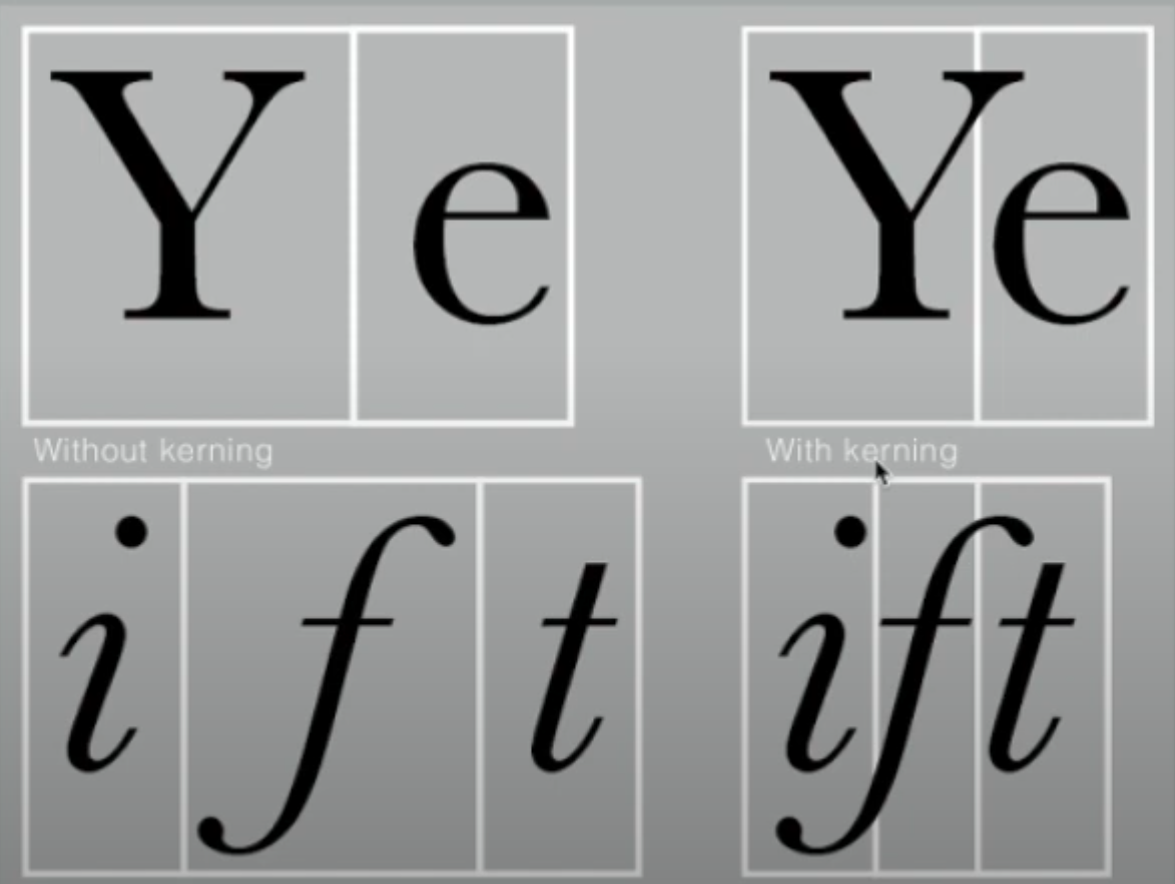
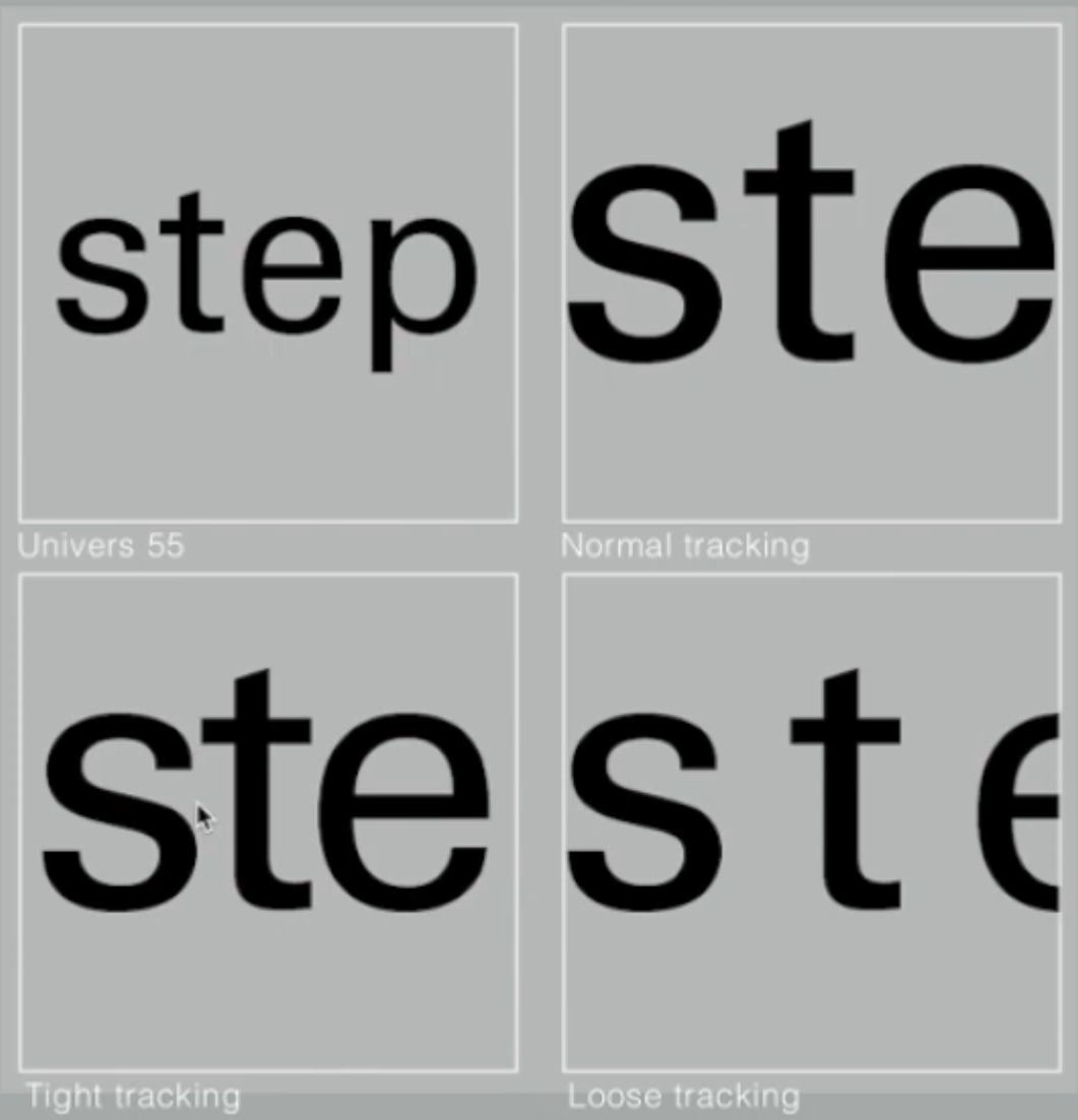
Text/ Tracking: Kerning and Letterspacing
- "Kerning" - the automatic adjustment of space between letters.
- "Letterspacing" - to add space between the letters.
- 'Tracking" - the addition and removal of space in a word or sentence.
- Margin spacing is extremely important
- When dealing with text, we must use the measurements of point systems
- InDesign shortcut keys:
- "Ctrl + ; " = Turn on/off the margin guides
- "Alt + Left arrow "= Decrease kerning spacing between letters
-
How do you raise/reduce the amount of kerning spacing when using the
shortcut key?
(Why so? It's to have more control over the kerning)
Preferences > Edit preferences > Units and Increments > Keyboard increments > Kerning/ Tracking
Designers tend to leave more spacing between the capital letters (VIsually appealing, smoother, more presentable)

|
| Fig 1.2.3 Tracking between the text |
It is worth noting that larger kerning means lower readability. (as the spacing reduces the recognizability of the letter patterns when a person reads it.)
Conclusion: Uppercase letters are drawn to be able to stand on their own, while lowercase letterforms require the counter form created between the letters to maintain the line of reading.

The left-side paragraphs undoubtedly are easier to read compared to the paragraph on the right.
Flush Left (Most Natural Formatting)
This format closely
mirrors the asymmetrical experience of handwriting.
-
Starts at the same point
-
Ends on the last word on the line.
-
Spacing between words is consistent throughout the text (Even grey
value)
Centred
This format imposes symmetry upon the text, assigning equal values and weight to both ends of any line.
- Adds pictorial quality to non-pictorial materials by nature.
- The centred format creates a strong shape outline
- It's important to amend line breaks to avoid jagged paragraphs.
Flush Right
This format places emphasis on the end of a line.
- Useful in situations like captions where the relationship between text and image might be ambiguous without a strong orientation to the right.
Justified
Seems like the centring format, but it also imposes a
symmetrical shape on the text.
- Expands or reduces spaces between words, even between letters sometimes.
- Produces a lot of white space in a paragraph.
- Requires attention to the line breaks and hyphenations.
WHEN settling in the field of typography,
-
Typographer's first job:
Clear, appropriate presentation of the author's message.
- A type that attracts the reader's attention before one can get to the actual words is simply interference and should be avoided. Keep it simple, if you see the type before seeing the words, change the type.
-
It's important to understand how different typefaces feel as text.
(Different typefaces different messages) -
Take into consideration of different textures of the typefaces.
(Type with relatively generous X-height/ relative heavy stroke width = a darker mass and vice versa.)


- Type size (Large enough for arm length distance reading)
- Leading (Create a balance between tight and loose leading spaces between letters to avoid distractions and confusion)
-
Line length (Shorter lines require less leading, and vice versa)
Rule of thumb: Keep line length between 55-65 characters.


|
| Fig 1.2.8 Samples of typeface |
Week 3 INDICATING PARAGRAPHS - HIGHLIGHTING TEXT
There are several options to indicate paragraphs:
-
Use "Pilcrow" symbol ( ¶ ), how to type: "Alt + 0182" on PC
-
Use line space (leading) between the paragraphs (Ensure
cross-alignment across columns of text)


-
Indentation
Standard indentation where the indent is the same size as the line spacing or the same point size of the text. (Saving space for more printing)Fig 1.3.2 Indentation to indicate paragraphs

-
Widows
A short line of the type left alone at the end of a column of text
Fig 1.3.3 Example of "widow"
-
Orphans
A short line of the type is left alone at the start of a column of text
Fig 1.3.4 Example of "orphan"


In flush left or right text, they are somewhat more forgiving towards widows by a bit. Not the orphans.


When need to change the font family from serifs to san-serifs, reduce the text size by 0.5 points.


Sometimes extending the special typography characters outside the reading axis is necessary, for example, Quotation ("")

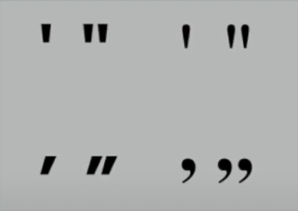
- People often misunderstand that the prime marks ( ' ) are not quote marks ( " ). The prime marks are used for the abbreviation for inches and feet. Thus,

|
| Fig 1.3.11 A Header in bold, Header extended to the side, Larger header size, and small CAPS header |

|
| Fig 1.3.12 B Header in small caps, italic, bold serifs and bold san serifs |

|
| Fig 1.3.13 C Header in small caps, lowercase italics, bold serifs and bold san serifs |
As such, the sequence of subheads can form a hierarchy. While there is no single way to express hierarchy, the possibilities of it can be limitless.

-
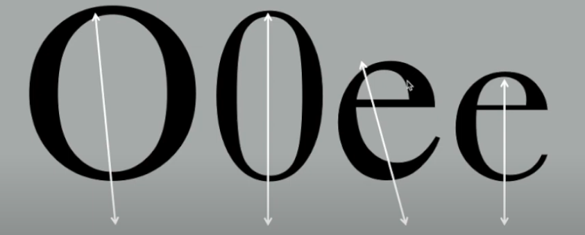
Baseline
The imaginary line of the visual base of the letterforms -
Median
The imaginary line defining the x-height of letterforms -
X-height
The height in any typeface of the lowercase "x".

|
| Technical terms of the letterforms |
-
Stroke
Any line that defines the basic letterform

-
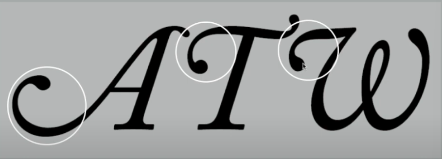
Apex / Vertex
The point is created by joining two diagonal stems (apex above and vertex below)

-
Arm
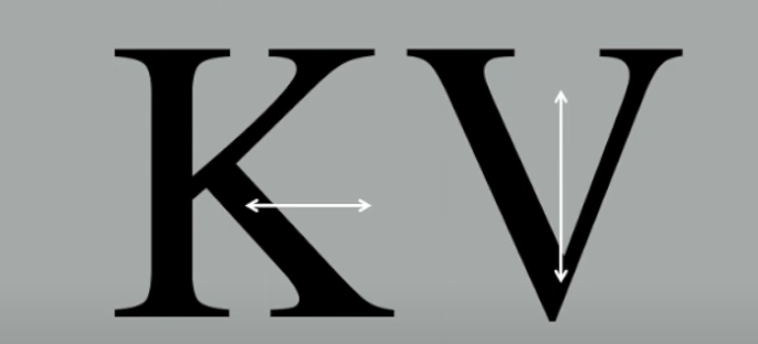
Short strokes off the stem of the letterform, either horizontal (letters E, F, L) or inclined upwards (letters K, Y)

-
Ascender
The portion of the stem of a lowercase letter that projects above the median.

-
Barb
The half-serif finish on some curved stroke

-
Bowl
The rounded form describes a counter. The bowl may be either open or closed.

-
Bracket
The transition between the serif and the stem.

-
Cross Stroke
The horizontal stroke in a letterform joins two stems together.

-
Crotch
The interior space where two strokes meet.
-
Em/en
em is the distance equal to the size of the typeface (48 points), and en is half the size of an em.
Often used to describe em/en spaces and em/en dashes.

-
Ligature
The character formed by the combination of two or more letterforms

-
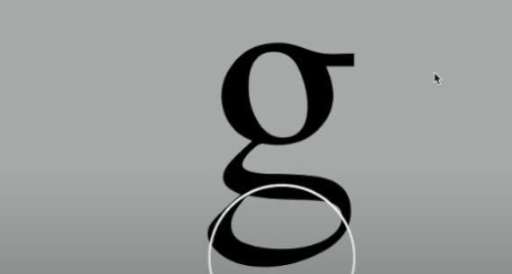
Link
The stroke that connects the bowl and the loop of a lowercase G.

-
Loop
In some typefaces, the bowl is created in the descender of the lowercase G.
-
Spine
The curved stem of the S

-
Spur
The extension of the articulates the junctions of the curved and rectilinear stroke

-
Stem
The significant vertical or oblique stroke

-
Stress
The orientation of the letterform is indicated by the thin stroke in round forms.
-
Swash
The flourish extends the stroke of the letterform.
-
Terminal
Self-contained finish of a stroker without a serif.

Small capitals, previously known as expert sets, are designed for the particular purpose of not disrupting the reading flow of the paragraph when there is the need to include multiple uppercase letters for a name (Example: The Design School = TDS)


"Extended" is an extended variation of the Roman font

↑↑↑ Back to top ↑↑↑
INSTRUCTIONS
Mr Vinod gave the class briefing on this whole module the module learning outcomes, and
Task 1 (20%) - Individual: Exercises
The first task will be exercises
that aid and benefit me in gaining theoretical and practical knowledge in
typography to inform and provide me with the necessary experience to take
on this module.
Submission in One layout in A4 size
Exercises such as:
- Type Expression
- Text Formatting

↑↑↑ Back to top ↑↑↑
Work Process


Final work digitalisation

|
| Font selection: Univers Lt Std 85 Extra Black |

|
| Ctrl + Shift + O "Create outline" |

|
| Create thin rectangles/ lines |

|
| Position the lines on the left side of "C" and O" and divide the letterform |

|
| Drag out and delete the excessive part to create a hollow gap in the letters. |

|
| Final work |
"Illusion"

|
| Font selection: Futura Std Heavy |
|
| Create duplicate |

|
| Reflect duplicated words horizontally 180 degrees |

|
| Reduce the opacity to 30% |

|
| Cut out the bottom part of the illusion using the Divide tool in Pathfinder |

|
|
Cut out the bottom part of the illusion using the Divide
tool in Pathfinder |

|
| Place the lower word under the box partially and cut out the excessive |

|
| Final work |
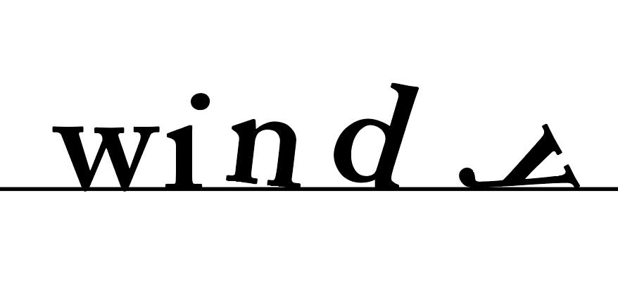
"Windy"

|
| The font selected: Adobe Caslon Pro Semibold |

|
|
Place the word exactly on the bottom line, and Ctrl + Shift + O "Create Outline" |

|
| Rotate the individual letter so that it seems like they have been blown and fell to the ground |

|
| Adjust the circle of the letter I to the right side to symbolize that it has also been blown away by the wind |
|
| Finish! |

|
| Final work |
|
| The font selected: Futura Sd Light |
|
| Create Outline |

|
| Place the "I" at the centre of the box to create a focal point |

|
| Final work |

|
| Final work compilation |


GIF Animation

|
| Wind effect animation (motion typography) by Hackernoon on Pinterest |


|
| Mock-up motion typography "Windy" — 14/10/2023 |
Days have passed, and I have realised that the animation still lacks something, as the animation alone can't really portray the actual meaning of the word "windy".

|
| The addition of 22 more frames |

|
| Final GIF motion type animation — 16/10/2023 |
Do not exceed more than 5mm (Three times Alt + Arrow Key) for text kerning
Task 2 TEXT FORMATTING
Before commencing the text layout exercise, Mr Vinod asked us to give the kerning and spacing a try to see the effects on the sentences. I tried out the kerning functions in Adobe InDesign 2023 in order to have direct observations on how they affect readability and liability.
Here I have used my name as a sample text for the 10 fonts:

|
| Before adjusting kerning |

|
| After adjusting kerning |
Text paragraph layout:


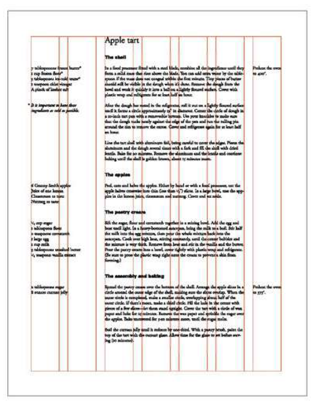
 |
| Fig 2.3 third layout design |


 | ||
The final choice of layout
|

Head
Gill Sans MT Bold, Gill Sans MT Regular
22 pt, 33 pt, 11 pt
11 pt, 22 pt, 33 pt
Body
11 pt
Align Left
Margins
Gutter
↑↑↑ Back to top ↑↑↑
FEEDBACK
Week 1 :
General Feedback:
- Do your best!
Week 2:
Specific Feedback:
Mr Vinod
- The "Chop" word for the 4th design has too many distortions, try reducing the chop marks and also closing the gap between them.
Ms Hsin Yin
- The "Chop" word design for the 4th one works fine, there is just a bit too much distortion.
- Compared to the other designs of the "Illusion" word, the 2nd design works the best among all the others. Especially on the 5th design, the design suggests it is a shadow with no related meaning to the word and can be difficult to read. But it's a good design of how the letters are combined.
- "I like how the "y" of the "windy" word just lies on the floor.
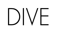
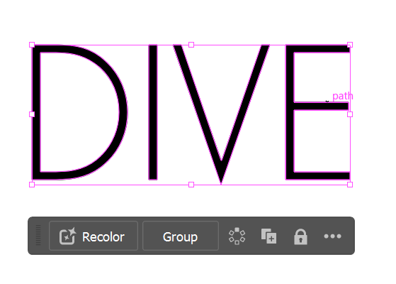
- For the "Dive word, it's smart to cut out the letter to represent the dive action. However, the "E" is cut a bit too much, resulting in the reader having a hard time reading the word. Next time try not to cut out too much the resembling shape of a letter such as "E", or "G", otherwise it will cause a reduction in the readability of the word. The 3rd design is viable, just a bit of manipulation is required. Place the "I" letter in the centre of the box to direct the focal point, and adjust all the letters to the same weight and size.
Week 3:
General feedback:
- E-portfolio: The overall portfolio looks great!
Specific feedback:
- E-portfolio: You should also add labels under the image for the digitisation process work to allow easier reading and referencing
- Digitisation: Increase the effect of diving by placing the letters V and E lower and closer to the bottom.
- Chop redesign
Week 4:
General Feedback:
- Good progress and final work on the GIF animation
Week 5:
General Feedback:
- The first and second sample of layout formatting seems doable, with the second one with the staircase design is quite interesting.
Specific Feedback:
- For the first sample, I see you have moved the weight of the paragraph to the bottom of the page. But try to move the left side paragraph upwards to match the same weight of positive space and negative space between the image and body paragraph on the right side of the page. Move to the same line as the caption of the image. Or if you want to give the second layout design a try, enlarge the header and add a staircase feeling to maintain equal positive and negative spaces.
↑↑↑ Back to top ↑↑↑
REFLECTIONS
- Experiences
Since the beginning of the class, I have had the feeling that the typography is not what I used to believe: boring and simple. With the exceptional introductions and explanations by the head of the typography subject, Mr Vinod, I came to the realization that typography doesn't only play with the look and design of the fonts, but also with several aspects such as the type expression and the text layout as I got the hands-on experience from this first assessment in which is an exercise before the real deal and journey of typography begin. In the type expression task, I had a lot of fun trying different styles, shapes and forms on the specific font hand-picked by my lecturers (Mr Vinod and Ms Low Hsin Yin). I also get to see others' creative works and perspectives during class sessions every Tuesday morning when Ms Hsin Yin kindly asked us to upload our work for weekly progress reports and feedback. Not only that, I also learned a lot on how to use Adobe InDesign which I don't have significant experience and knowledge on it.
- Observations
Throughout this whole assessment, I spent some of the time to take a look at some of the skilled and professional work examples on the Internet whether on Pinterest or their respective website blog. Their work not only amazed me but also expanded my perspective on the limitless possibilities of typography design at the same time. During every lecture, tutorial and practical class, I observed and remembered the main feedback from the lecturers which will prove their importance along my journey of designing with ups and downs, such as the use of positive and negative spaces to create balance in paragraph layout.
- Findings
I believe I have quite a lot of findings just in mere 5 weeks into my degree, not to mention in my first task in typography class. To put it short, I found out that there are many particular details in every letter in a font (type family) from serifs to sans serif and how each font portrays different moods and feelings to the reader (reminiscent, visually engaging, premium feel). Additionally, there are many findings on how many attributes and characteristics of text can have a huge impact on not only aesthetics but most importantly, readability which is the main purpose of typography. Talking about myself, I found out that I still lack the skills to pilot this wonderful application (Adobe InDesign) thus I believe I can humbly strive for more knowledge. As the saying goes: "Knowledge is power".
↑↑↑ Back to top ↑↑↑
FURTHER READING
Week 1
The book I selected to read in week 1 is: I.D.E.A.S. Computer Typography Basics by David Creamer

Starting from the book's very first page, I read about the idea that the author wants to convey: "..., the first goal of typography was readability." It is the foremost important part of typography, that is to make the writings readable by others as the sole purpose of writing is to transfer information to the reader in an efficient manner.
Thus in this book, the author provides us with the necessary information to guide us on computer typography by understanding the font options to produce a report that not only contains practical info but is also easier for us to read and understand.
From this book, I've learned about:
- Different font categories serve different purposes in different usage.

- The font styles (plain, italic, bold, bold italic)
- The font families (fonts of the same design but different in weight from one another.)
- Identifying and selecting a font with considerations of readability
Week 2
The book I selected to read in week 2 is A Type Primer by John Kane.

To acquire more knowledge on reforming typography based on the word's definition by the usage of visual graphics. I referred to pages 60 - 64 of the book to get a grasp of how to ideate.


ENGLISH IS NOT CHINESE


Typographic principles
- Contrasts


- Format
The size and proportion of the page or screen, International Standards Organisation (ISO) formats on the size of the paper which have a 1:1414 ratio difference in paper size ranged from A0 all the way to A10. - Typography selection
One of the best methods to decide which typefaces to use is to understand their applications and thus ultimately dictate their usefulness. Ask yourself these questions: Will the type be digital or print? Range of weights and postures? Variety of fractions and numerals? Does the typeface have a complete set of OpenType options for numbers?
Text Type of the page suitable for various purposes
Display Type of the page to quickly catch the reader's attention - Reading direction and scanning
Focal Point is a dynamic composition that is meant to attract the attention of viewers. - Free placement of text and photographs/illustrations to create dynamic compositions
- The grid
A tool for designers to create compositions with unity and variety.
During grid selection, we should consider these elements of the project:
- media
- format
- use
- image size
- typographic scope
- word count (or lack thereof)
- expandability
Anatomy of grids
Grid types
- Book and manuscript grid
- Columnar grid
- Modular grid - Hierarchy
- Unity and Variety
- Symmetry and Asymmetry
- White spaces
- Typeface pairing
Unfortunately, there are no fixed formulas and prescriptions to pair different typefaces together. Thus, it is wise to make sure the fonts respect the contents and ensure readability.


Starting on page 146, I came across the page that informed me on how to express hierarchy in the paragraphs.
- Establishing a format
Devise a format that expresses differences within the text after analysing and organising the content. - Establishing a hierarchy
As an example: single line space can indicate a break between paragraphs whilst double line spaces indicate breaks between sections of text. - Typeface choice
Choose typefaces with an expert set that includes lowercase numerals and fraction characters when there is the need to use numbers and fractions. - Ligatures
Often can be seen in virtually all fonts on letters f and i - Reinforcing structures
As an example from the image below, a flush right paragraph on the left and a flush left paragraph on the right can strengthen the formal organisation of the page. - Title treatment
Enlarging the header size not only reinforces hierarchy but also provides an ambiguous starting point for reading. - Secondary heads
Using italics for the secondary heads reinforces their place in the overall hierarchy indicated by the additional line space. - Italic within the text
Italics within the text can inform a reader about the things that need to be noted. - Revised format
Divide the type area into more columns providing a new, separate column for other text. Thus possibly able to increase the white spaces of the page.


Comments
Post a Comment